google.com
Landing Page Analysis
Chat Now
Summary:
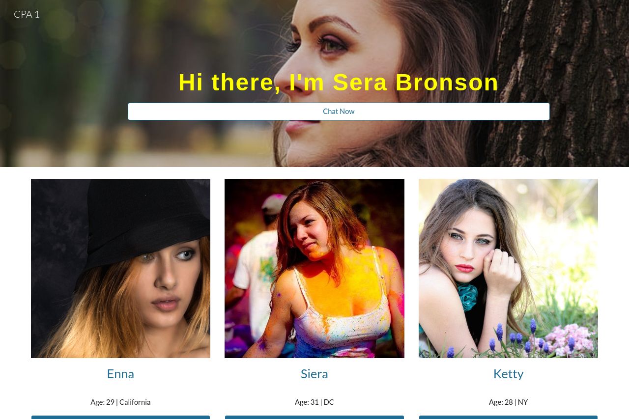
This landing page is pretty rough around the edges. The main headline "Hi there, I'm Sera Bronson" doesn't match the images of other people like Enna, Siera, and Ketty, creating confusion. There's no clear value proposition or indication of what the page is about, which is a huge problem. It doesn't tell the visitor what to expect from "Chat Now."
Design-wise, the yellow text on a distracting background makes the main headline hard to read and not professional at all. The "Chat Now" buttons are generic and could easily be overlooked.
The layout lacks hierarchy, with images of women taking up most of the space but giving no context. There’s no evident structure or flow, making navigation a chore. Lastly, the credibility is non-existent due to lack of any social proof, testimonials, or contact details.
- Clearly define the purpose or value proposition of the page.
- Improve the visual hierarchy to guide users through the most important information.
- Add trust elements like testimonials or reviews to build credibility.
- Ensure consistent messaging and alignment between headings, images, and actions.
- Use specific action-oriented language for CTAs.