swirl.cx
Landing Page Analysis
Enhance your guest experience with Swirl's AI-powered restaurant management solutions. Boost efficiency and increase profits.

Summary:
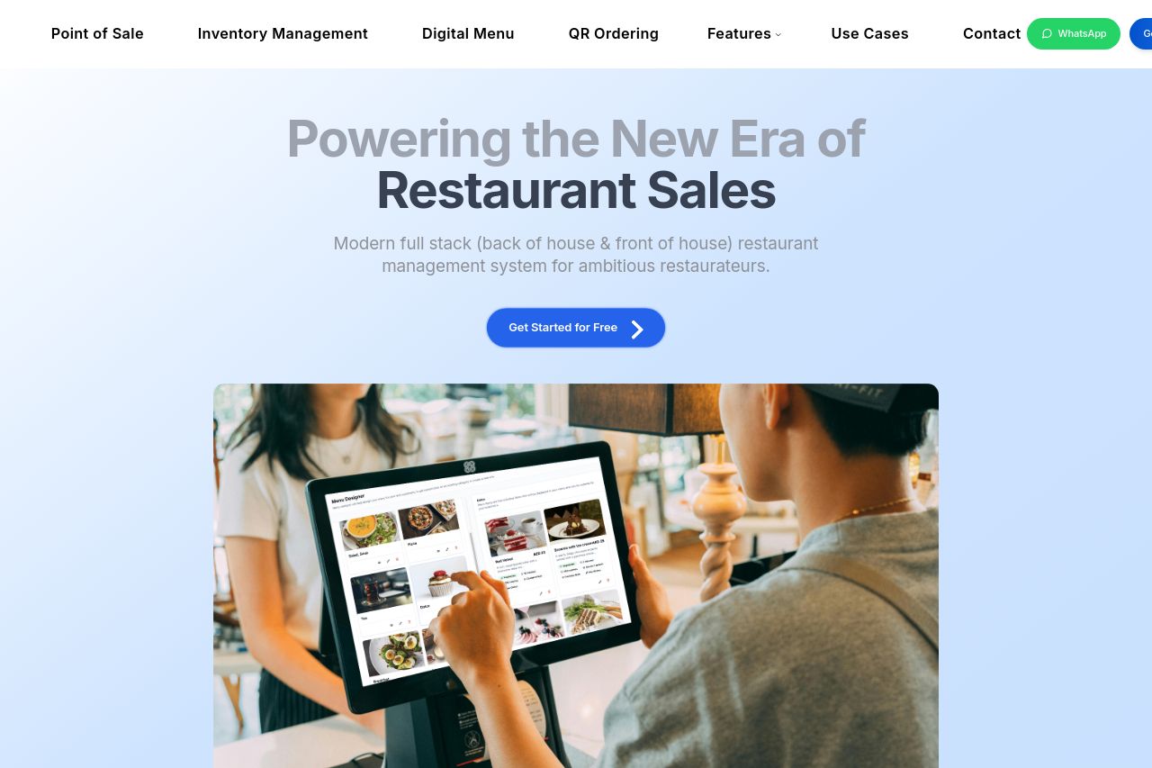
The landing page for Swirl's restaurant management platform is generally well-structured, but there are some shortcomings that could be addressed. The value proposition is moderately clear, though it could be pushed further by being more explicit. Audience targeting is mostly effective; restaurant owners/managers seem to be the focus. However, the tone feels somewhat banal and lacks personality, making it less engaging. This could lead to missed opportunities in captivating the audience.
Readability suffers from lengthy paragraphs and sometimes jargon-heavy language. The typography is generally easy to read, providing a clear hierarchy, but some areas lack consistent formatting.
In terms of design, the site maintains a clean and professional look. Yet, the visual hierarchy could be enhanced further, as some key details are lost in the blandness of repetitive styling. The use of colors is safe but uninspired, not making full use of color theory to draw attention where it's needed most.
Structure-wise, the information flows logically, though there could be better emphasis on certain elements like call-to-action (CTA). These CTAs are visible but lack urgency or compelling reasons to click, which is a major missed chance for conversion.
Credibility is handled decently with customer logos and clear contact information displayed. However, more trust signals like testimonials or awards would bolster this further.
- Enhance the uniqueness and engagement of the value proposition by adding more specific benefits or features.
- Reduce text complexity and jargon to improve readability, breaking text into shorter, clearer sections.
- Boost visibility and appeal of CTAs by using more dynamic and compelling language.