clube.ai
Landing Page Analysis
Junte-se ao clube onde empreendedores, criadores e profissionais compartilham estratégias reais para crescer com Inteligência Artificial.
Summary:
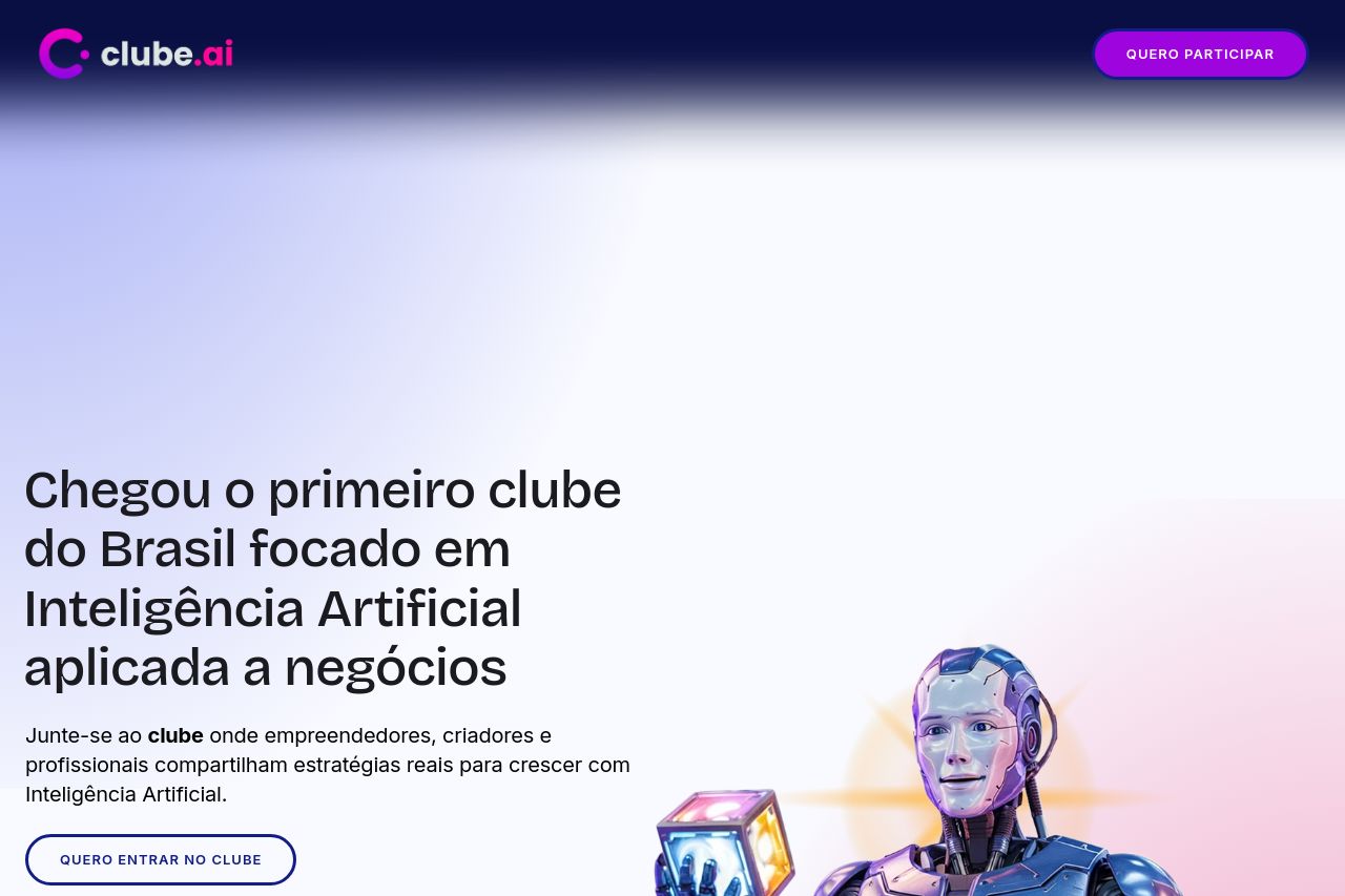
The landing page does well in communicating a solid and clear value proposition, stating upfront that it's the first club in Brazil focused on AI for businesses. The visuals are strong with images that relate well to the theme. However, the design feels a bit cluttered at times, making it less visually appealing for a technology-focused audience. Typography is generally consistent, but the body text can become too dense. There's not enough engagement or interaction highlighted in some parts, making the call to actions less potent. The reliance on big text blocks in certain sections makes it visually uninteresting, especially since the audience is likely tech-savvy and would appreciate a more dynamic presentation of content.
- Reduce text block sizes and increase use of bullet points for clarity.
- Improve visual hierarchy to make important points stand out more clearly.
- Enhance CTA visibility and differentiation to guide user action more effectively.