strikeready.com
Landing Page Analysis
StrikeReady is an AI-powered Security Command Center. We are providing actionable cyber security defense solutions to optimize your company's threat response.
89
Website:
https://strikeready.comGenerated on:
May 28, 2025Score:
89/100Audience:
Mid market financial institutionsShare on:
Summary:
70
Messaging
85
Readability
90
Structure
75
Actionability
90
Design
100
Credibility
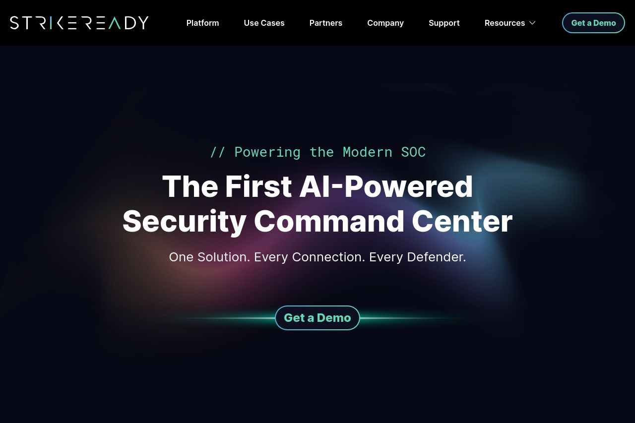
The landing page for StrikeReady is visually polished and well-structured overall, catering specifically to mid-market financial institutions.
Good Points:
- The hero section immediately grabs attention with its bold claim, "The First AI-Powered Security Command Center," setting the stage for an impactful experience.
- The trusted by section with recognizable logos adds trust and credibility at a glance.
- Typography is clean and readable, with a consistent hierarchy making the content approachable and digestible.
Areas for Improvement:
- The value proposition could be further clarified; it's a bit too broad and doesn't directly address the specific needs or pain points of the target audience.
- There is a lack of engaging visuals or dynamic elements which might make the page more captivating.
- The CTA usage is repetitive and kind of bland. More specific calls to action could encourage immediate action instead of just "Get a Demo."
- Some jargon-heavy sections can alienate less technically inclined decision-makers. Simplifying this text and offering straightforward summaries could improve accessibility.
Overall, the site serves its function well with strong design and credibility elements, though it could considerably strengthen its connection to visitors through more targeted messaging and engaging elements.
Main Recommendations:
- Refine the value proposition to clearly address specific industry pain points or desired outcomes.
- Incorporate more engaging visuals or dynamic elements to retain user interest.
- Diversify and specify CTA language to better align with visitor motivations.