vastusage.in
Landing Page Analysis
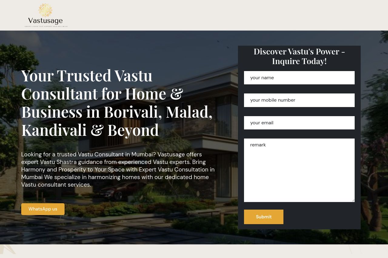
Looking for a trusted Vastu Consultant in Mumbai? Vastusage offers expert Vastu Shastra guidance from experienced Vastu experts. Bring Harmony and Prosperity to Your Space with Expert Vastu Consultati
Summary:
This landing page does a solid job in outlining the services of a Vastu consultant, but it suffers from some major usability and design flaws.
The value proposition isn’t very clear—though it's mentioned they are reliable and experienced, this message is buried in a sea of words.
The design is somewhat cluttered and meh, with too much text packed into each section, making it hard for the user to focus on the core message. Information hierarchy is off; the text is all over the place. The text blocks are large and chunky, making the content feel like a chore to read. The CTA buttons lack emphasis and just blend into the background.
Social proof is displayed and there are testimonials, which lend some credibility, but the rest of the page drowns them out. The layout lacks effective spacing, making it feel cluttered and overwhelming rather than inviting.
The navigation is lacking; no clear menu or logical flow guides the user through the offerings. While the page uses images, they're not adding much value in terms of illustrating what's being offered here. Whitespace is limited, failing to break up content and direct focus.
While all the right components seem to be present, the execution falls flat, making it challenging for visitors to navigate, understand, and take action.
- Rework the main value proposition to be more direct and clear. Highlight key selling points right away.
- Simplify the text layout by breaking long paragraphs into bullet points or shorter sentences.
- Boost the CTA visibility with contrasting colors and more action-oriented language.
- Introduce a clear navigation system with headings for easy browsing.
- Use whitespace more effectively to improve readability and guide focus.