wprise.co
Landing Page Analysis
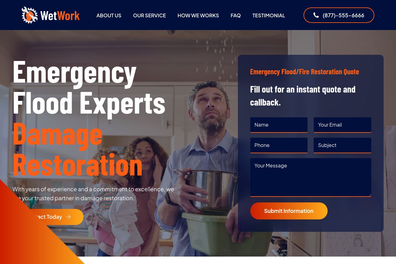
With years of experience and a commitment to excellence, we are your trusted partner in damage restoration.

Summary:
The page aims to convey credibility and professionalism but falls short in several key areas.
The messaging lacks clarity and audience-specific alignment. It says "Emergency Flood Experts" without further elaboration on unique features or audience specifics beyond the basic service offerings. The CTA "Submit Information" feels vague and doesn't encourage urgency or action.
In terms of readability, the text is decently simple, but separation between sections can be improved. The design employs a color scheme that’s visually appealing with blues and oranges, although consistency is disrupted by awkward sections and inconsistent spacing.
Structure-wise, logical flow exists, but supporting details are not effectively prioritized and quick access to information is inhibited. The actionability section suffers due to the confusing presence of multiple CTAs and minor distractions.
Credibility is somewhat established with testimonials and some social proof, but lack of transparency in company identification and additional trust signals like badges or partnership logos weakens it.
- Enhance the main value proposition with specific benefits and examples.
- Improve CTA text to be more focused and action-oriented.
- Increase contrast and hierarchy in content layout for clearer readability.
- Add more robust information about experience and credentials directly.
- Strengthen credibility with more visible company and founder details.