generateads.ai
Landing Page Analysis
72
Share on:
Summary:
60
Messaging
70
Readability
80
Structure
60
Actionability
65
Design
80
Credibility
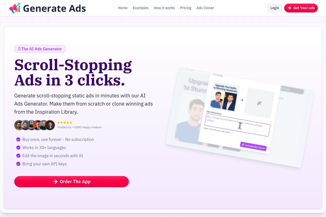
Generate Ads offers a straightforward promise—creating ads in three clicks. The bold headline immediately catches attention, and the supporting text provides a concise rundown of the benefits, such as unlimited use, and multilingual support. However, the design and layout could use more sophistication to match the expectation set by the value proposition. The use of social proof is commendable, with testimonials and trust indicators adding credibility. Still, the presentation could be more uniform and cohesive. The overall call-to-action is clear but somewhat buried among other visual elements, and the page could benefit from improved visual hierarchy and contrast to make important elements stand out better.
Main Recommendations:
- Enhance visual hierarchy by using larger fonts and more contrast for the main CTA.
- Improve consistency in design elements, like typography and color scheme, for a cohesive look.
- Make the call-to-action button more prominent with increased contrast or size.