keptica.com
Landing Page Analysis
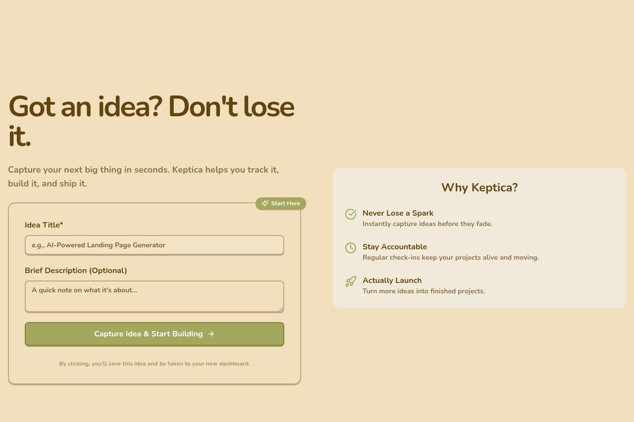
Keptica helps you capture fleeting ideas instantly, track their progress with regular check-ins, and turn them into successfully launched projects. Stop ideas from dying in your notes.

Summary:
The landing page is minimalistic, but not in a good way. The muted beige color palette lacks vibrancy, making the whole page feel bland and uninspired.
There's a clear call to action with 'Capture Idea & Start Building,' but it's a bit too direct and lacks compelling language to draw users in. Clarification is needed on how users will benefit concretely from the service.
The copy, 'Got an idea? Don't lose it,' is catchy, but everything else doesn’t reinforce this urgency well enough.
The right panel describing Keptica's benefits like 'Never Lose a Spark' is a good attempt, but feels too generic without deeper insights.
The contact details and critical information are buried, adding to a sense of uncertainty for users looking for credibility signals. Focus more on visuals, imagery, and explicitly defining user value in the top sections.
- Enhance the color palette to be more engaging and lively to attract users.
- Provide more specific examples or case studies that showcase the value of using Keptica.
- Include testimonials or social proof elements to boost credibility.