quidget.ai
Landing Page Analysis
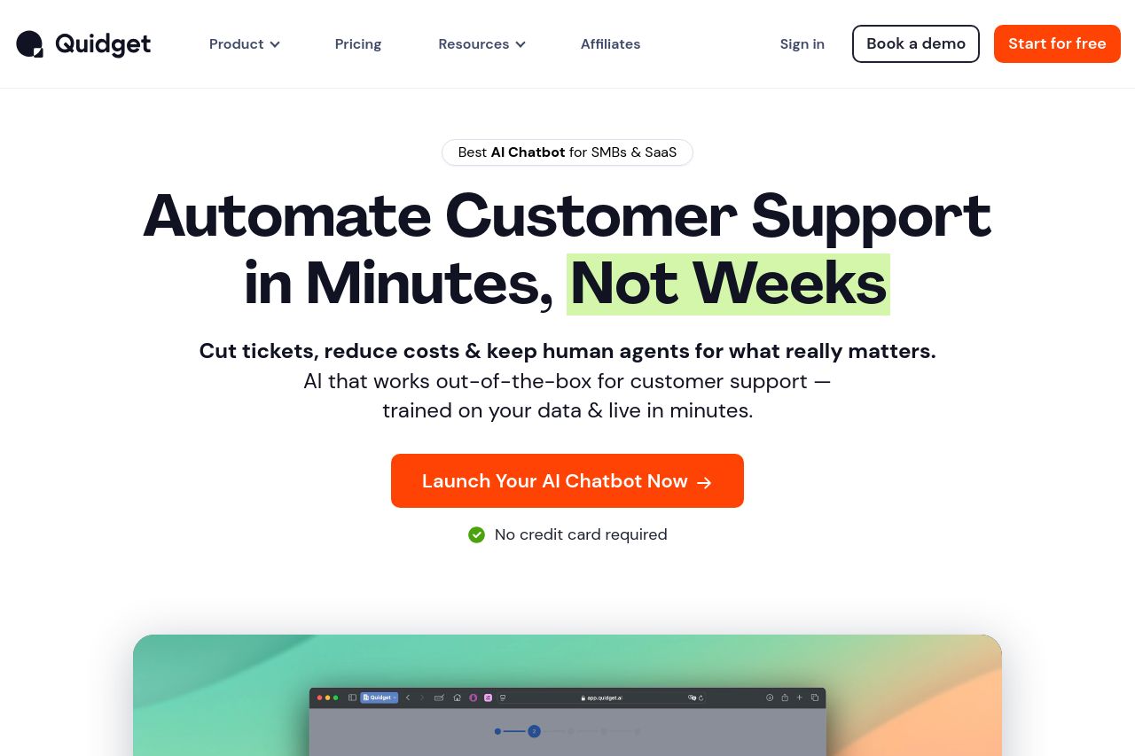
Launch an AI chatbot that answers questions, captures leads & cuts tickets — all without coding. Quidget speaks 45+ languages & works right out of the box.
Summary:
The landing page excels in some areas but falls short in others. The value proposition is forcefully conveyed with clear, bold headlines like "Automate Customer Support in Minutes, Not Weeks." The problem is the over-abundance of repeated information, like "No credit card required" and "2-min setup," which are cluttering the space. The CTAs are strong—"Launch Your AI Chatbot Now" is clear and action-oriented—but their placement could be improved to enhance flow.
The design sticks to a simple layout but lacks sophistication. It's neither groundbreaking nor innovative, just safe and predictable. While the color scheme supports the text and CTAs, the use of repetitive colors dulls the visual impact. Trust elements like ratings and certifications do solid work to create credibility—though the cookie popup appearing multiple times feels desperate and distracting.
The focus on features is overstated, making it hard for the user to find unique selling points. The features are modularly presented, which helps with clarity, but there's a mechanical feel that robs the page of any inspiring touch. Text is generally succinct, aiding readability, but the typography feels uninspired and lacks "pop."
Overall, while this page strikes several chords right, it lacks flair and impact precisely where it's needed to dazzle its audience. The cookie popup distraction and overly repetitive highlights work against the sophisticated image it's trying to project.
- Limit repetition of highlights like 'No credit card required.'
- Improve color contrast and diversity for a more engaging visual.
- Refine cookie popup usage to not clutter the view.