com.br
Landing Page Analysis
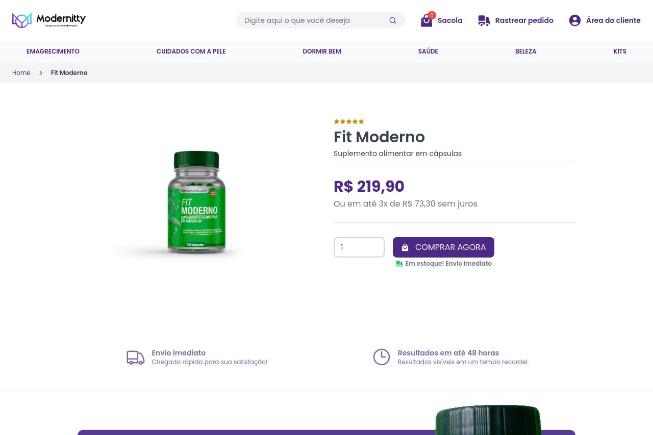
Suplemento alimentar em cápsulas
Summary:
The landing page for Fit Moderno displays a generally coherent design with a clear product image and straightforward description. However, the value proposition could be stronger; while it highlights the speed of results, more compelling language could amplify urgency and benefits. The color scheme is consistent, but the CTAs lack a punch of urgency. Repetitive CTA placements do ensure visibility, though. Information is logically structured to some extent, yet the text-heavy presentation might overwhelm visitors who prefer ease of reading. Though credibility is boosted by testimonials, the imagery feels a bit staged and does not deeply engender trust. Visual hierarchy is maintained mostly well, but could benefit from a more distinctive differentiation in text styling. Overall, a more captivating narrative and a refined layout would likely elevate the page's effectiveness.
- Strengthen the main value proposition to clearly communicate unique benefits.
- Simplify text and break big blocks into shorter paragraphs.
- Enhance CTA buttons with more urgent and action-oriented language.