zocktech.com
Landing Page Analysis
Default page
76
Share on:
Summary:
60
Messaging
90
Readability
70
Structure
70
Actionability
85
Design
60
Credibility
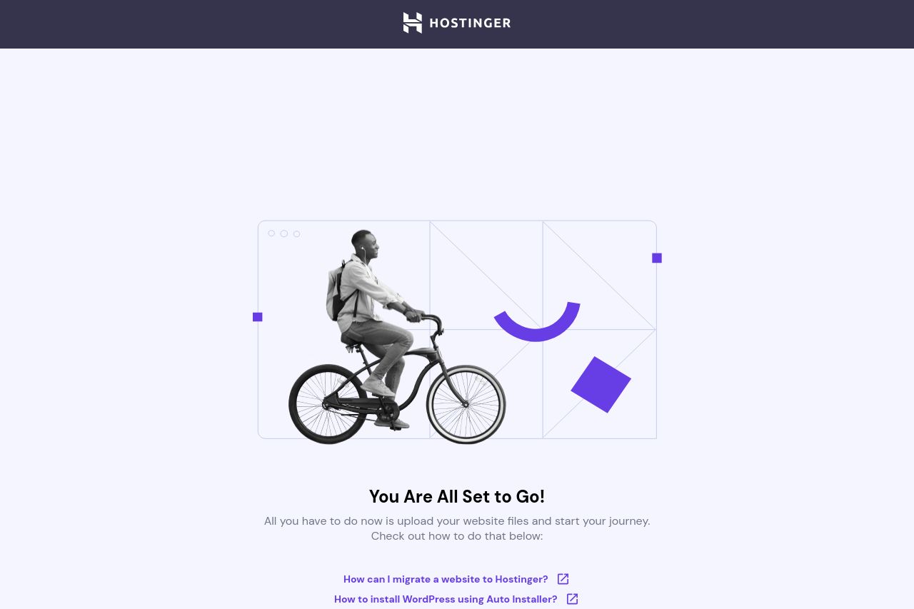
The page exudes simplicity, primarily focusing on directing users to upload website files. However, the header feels overly simplistic. The central image of a person on a bike seems disconnected from the context of website hosting, leading to confusion about its relevance. The supportive text beneath, while clear, lacks depth. Fortunately, links provided for further instructions do add some utility. The subtle color scheme maintains a clean aesthetic but borders on dull. It's a blend of minimal elegance and missed opportunity for engagement.
Main Recommendations:
- Incorporate more relatable imagery that speaks directly to digital hosting.
- Add a short explanation or benefit statement about the process.
- Enhance color dynamics to make CTAs and key info pop more.