motobicycles.com
Landing Page Analysis
Das ist MOTO
Summary:
**Moto Bicycles' landing page has its strengths but plenty to critique. **
Positively, the site targets bike enthusiasts well, with a focus on urban lifestyle and promises of superior pedal grip and wide platform. Social proof is present, showing awards and customers’ security. **
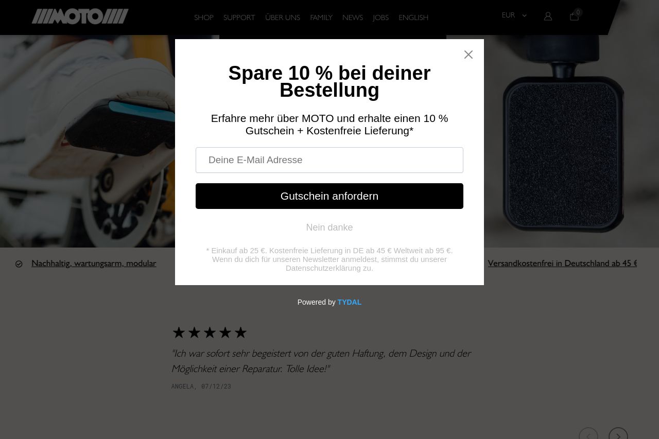
On the downside, the design is cluttered with overlapping elements, such as the newsletter pop-up blocking the text behind it, which hinders readability and user experience. The visual hierarchy is weak, failing to direct users' attention effectively. The blurred distinction between sections makes navigation tedious. The messaging lacks a clear value proposition upfront and fails to outline distinct features in a compelling way.
Overall, while there are good elements, the site comes off as unfocused and doesn’t align tightly with the audience's expectations, needing serious refinement in structure and actionability. **
- Rework pop-up placement to avoid overlapping with content.
- Strengthen the visual hierarchy to guide user attention more effectively.
- Enhance clarity of the main value proposition in the hero section.