landinganalyze.com
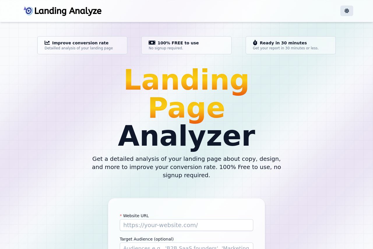
Landing Page Analysis
Get a detailed analysis of your landing page about copy, design, and more to improve your conversion rate. 100% Free to use, no signup required.
Summary:
Clean but Bland: The landing page succeeds in creating a clean and straightforward presentation but lacks any real wow factor. The main headline is clear but could use more excitement or urgency. The reassurance that the tool is free and doesn't require signup is a strong point, but repeating it doesn't necessarily add value.
Color and Contrast Challenges: The background is a soft gradient, but it doesn't do much to draw attention. The contrast with some text elements isn't fantastic, which might lead to readability issues. The yellow and orange gradient in the headline looks dated and doesn't complement the rest of the palette.
Layout: The layout is quite functional, but the grid background lends a somewhat retro feel that doesn't quite match modern design aesthetics.
Call to Action: The CTA is well-placed but could be more enticing. "Analyze my Landing Page" is direct but lacks a punch.
Content Engagement: While there is a small section on recent analyzed pages, the viewer is not sufficiently engaged or persuaded why they should care about this information. The FAQ is decent in covering common questions but is buried in the flow, leading to a decreased impact.
- Update the headline to add more urgency or uniqueness.
- Choose a more engaging color for the CTA button to enhance visibility.
- Consider a more modern color scheme and typography to improve the aesthetic appeal.