pipeorganmap.com
Landing Page Analysis
Explore and contribute to Pipe Organ Map — the free international database with interactive map, stoplists, photos, and builder info.
Summary:
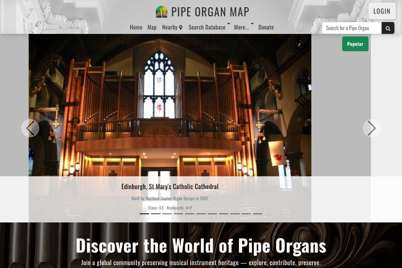
Overall, the site caters well to a niche audience interested in pipe organs, with a clear and engaging purpose conveyed throughout the sections. The hero section captures attention with its striking image and a clear invitation to explore or contribute, though it could improve with more specific audience targeting. The CTA placements are prominent yet repetitive, leading to a bit of overload.
The readability suffers from lengthy text blocks, which could be broken up for better engagement; however, typography is clean and easy to read. Design elements maintain consistency but lean towards being unexciting. Social proof and credibility are fairly strong, solidified by testimonials and data points. Navigation is straightforward, but headings could be more distinct for effortless browsing.
- Create a more focused CTA with varied action verbs to prevent overload.
- Break down text blocks into shorter, digestible sections for better readability.
- Enhance distinction among headings with varied font sizes and colors for easier navigation.