barbershopmir.ru
Landing Page Analysis
56
Share on:
Summary:
40
Messaging
60
Readability
50
Structure
45
Actionability
65
Design
60
Credibility
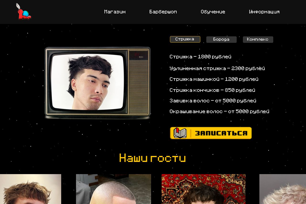
The page has an intriguing retro aesthetic but seriously lacks clarity in its messaging. The TV screen image used for the haircut details is a unique touch, yet the font choice and design make it look cluttered and hard to read. Pricing is visible, but there's no explanation of services, which could confuse visitors. The gallery of guest images is well-arranged, but that's about it for customer engagement. Navigation isn't very intuitive, and the call-to-action button sticks out like a sore thumb against the busy background. Design elements have a certain charm but could still use cohesion to give a more professional feel.
Main Recommendations:
- Add clear explanations or descriptions for each service offered.
- Make the call-to-action button consistent with the overall design theme.
- Improve navigation clarity and ensure sections are distinct.