supasubmit.com
Landing Page Analysis
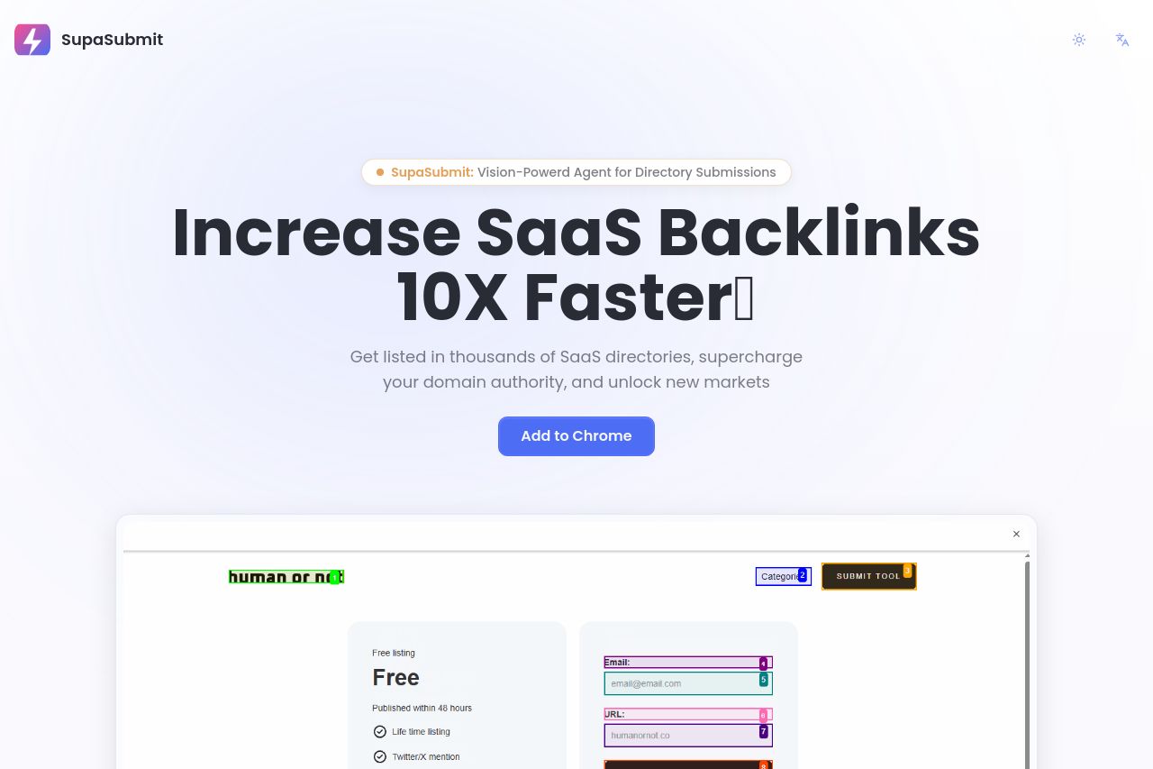
Get listed in thousands of SaaS directories, supercharge your domain authority, and unlock new markets
Summary:
SupaSubmit's landing page does well in showcasing its purpose: boosting SaaS backlinks efficiently. The main value proposition is clear, promising speed and ease with a straightforward call-to-action button. However, the cutesy tone and minimal variation in text size can dilute the professional touch needed for B2B audiences. The sections are logically structured, but typography and layout deserve more attention to optimize readability and engagement.
The design maintains a clean look with consistent branding, yet the color usage could push contrasts more in places to punctuate CTAs effectively. While it includes useful social proof, a robust repertoire of customer testimonials and success stories could further bolster credibility. Overall, the page manages to keep the navigation intuitive, guiding users through features to pricing efficiently, but a stronger narrative arc could enhance persuasion.
- Enhance text variation and clarity in CTAs to make them stand out more.
- Incorporate customer testimonials and specific success stories to improve credibility.
- Improve typography hierarchy for better readability.