e-invoice.be
Landing Page Analysis
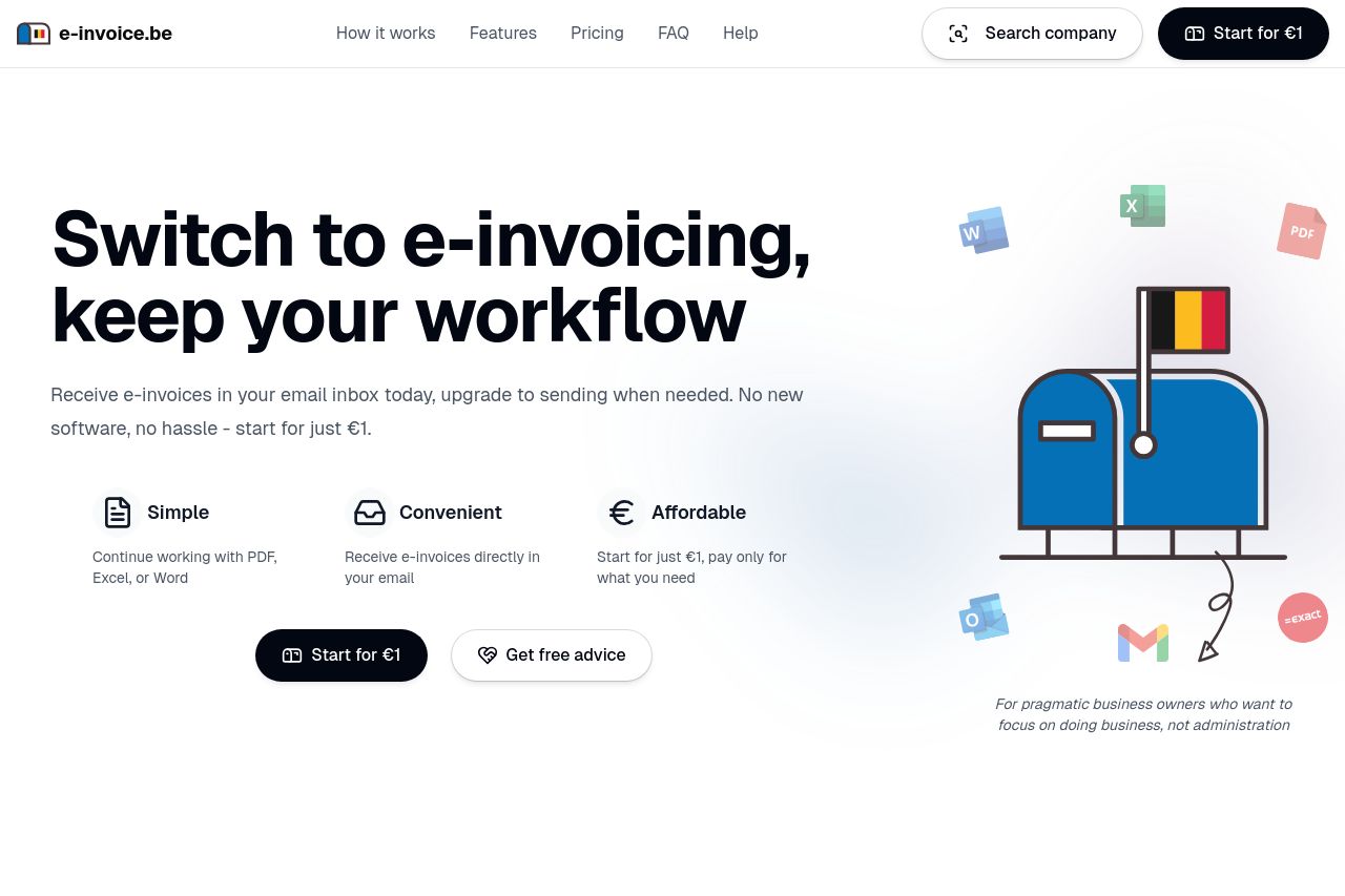
Simple, secure, and convenient e-invoicing solution for Belgian businesses. Receive e-invoices directly in your email inbox. No new software needed, no hassle.

Summary:
The landing page effectively presents the e-invoicing solution with a clear, simple, and professional tone that might appeal to Belgian business owners. The repetitive use of €1 as a starting point for pricing captures attention and creates urgency. The page is well-structured, from highlighting the benefits in the hero section to demonstrating easy steps for adoption. However, some sections feel cluttered, especially with testimonials that could be more strategically placed. The CTA placement could be more apparent, as sometimes it blends with other elements. Overall, the landing page does a decent job, but there's room for improvement in CTA emphasis and reducing visual clutter.
- Enhance the CTA buttons to stand out more, perhaps with different colors or borders.
- Simplify and condense testimonial placement for better flow and visual appeal.
- Add more whitespace to avoid clutter and improve focus on key elements.