alink.space
Landing Page Analysis
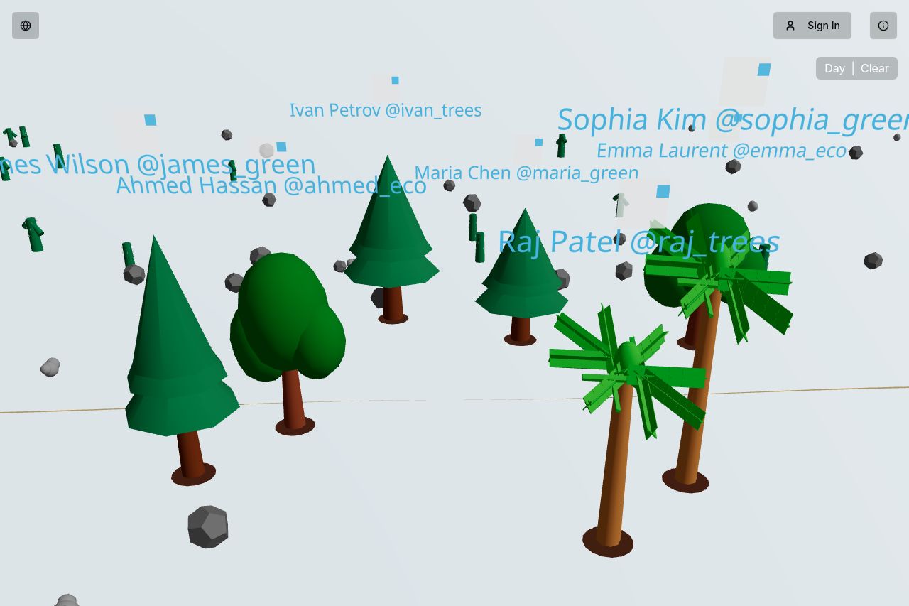
Plant virtual trees and help fight desertification in the real world
Summary:
The landing page has an interesting interactive approach, using 3D trees and user names, which suggests a focus on environmental themes but feels too abstract without much context. The lack of clear messaging and value proposition leaves users guessing what the site is actually about.
The design uses a simple, clean layout with good white space, but the text overlay on the graphics is hard to read due to poor color contrast. The CTA buttons like "Donate Real Tree" and "Marketplace" are present, yet they lack emphasis and urgency, blending too naturally into the background.
Overall, while the novelty of the design could initially catch interest, the lack of clear direction, poor readability, and inadequate prominence of CTA elements hinder any strong conversion potential.
- Improve value proposition clarity by clearly stating the purpose of the page at the top.
- Increase contrast between text and background for better readability.
- Make CTA buttons more prominent with contrasting colors to draw attention.