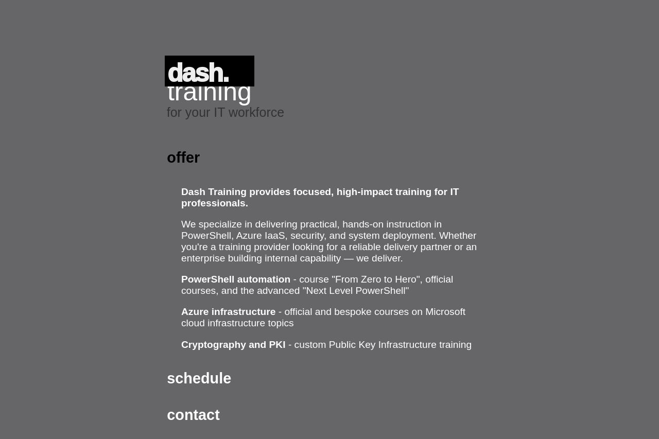
dash.training
Landing Page Analysis
Training provider of Microsoft cloud and PowerShell classroom courses and online microlearning.
45

Website:
https://dash.trainingGenerated on:
May 19, 2025Score:
45/100Audience:
training centers, it companiesShare on:
Summary:
45
Messaging
50
Readability
55
Structure
40
Actionability
35
Design
30
Credibility
The landing page is heavy on text and lacks engaging visual elements, which doesn’t help in grabbing attention. The color scheme is dark and a bit dreary, making the contrast surprisingly low and hard to read in certain areas. The messaging, although tailored somewhat to IT professionals, still feels quite generic and doesn’t highlight enough unique selling points. Overall, the structure is a bit confusing, as the headings like 'offer' and 'schedule' don't clearly direct the user towards specific actions or key benefits. The typography lacks hierarchy, making it difficult to quickly scan for essential information.
Main Recommendations:
- Increase text contrast for better readability.
- Revise the design for better visual hierarchy and engagement.
- Add visuals or icons to support and break up the text.