webflow.io
Landing Page Analysis
Alvana - Webflow HTML website template
Summary:
Overall, the landing page is quite solid but not without flaws.
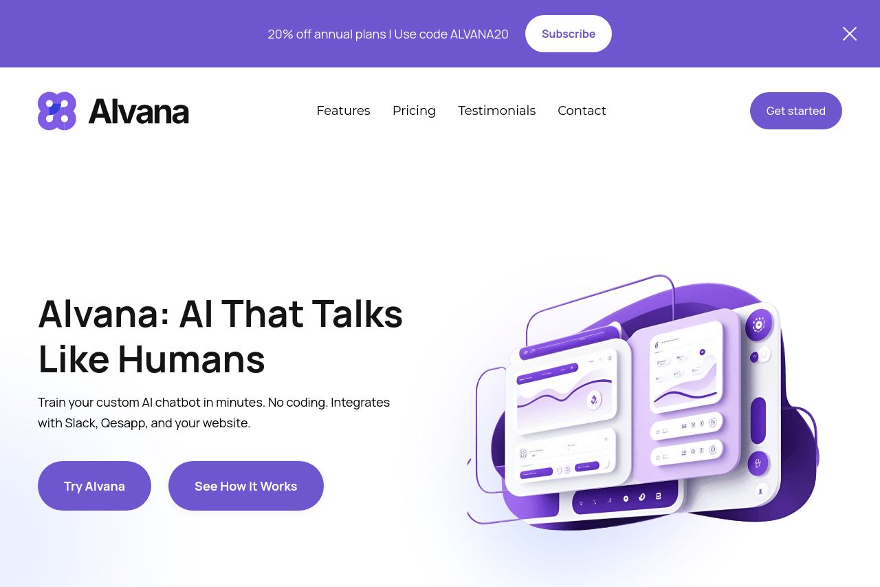
The design is cohesive and uses a consistent color scheme, which enhances the brand's identity. The purple CTA buttons stand out well. However, there's an over-reliance on generic logos like "Logoipsum," which can diminish credibility.
Messaging does a good job of explaining the product's features but could be sharper about audience targeting. The phrase "AI That Talks Like Humans" is a strong hook but lacks depth in subsequent explanations.
Structure works well as important information is prominently displayed and logically organized. But the logo section feels redundant.
The readability is hindered by the dense use of text. Some sections could benefit from breaking into shorter, more digestible pieces.
On credibility, the presence of testimonials adds trust, but real client logos would further bolster this aspect.
- Replace generic logos with real client logos to boost credibility.
- Break down dense text sections into more digestible chunks.
- Sharpen the messaging to clearly define the target audience.