lovable.dev
Landing Page Analysis
Build software products, using only a chat interface

Summary:
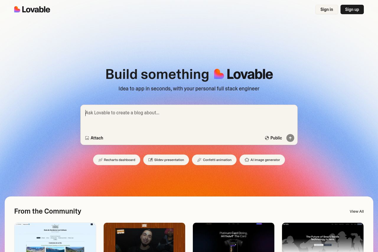
The landing page gets full marks for its visually appealing color gradient background, which makes the brand stand out beautifully. The main headline "Build something 💖 Lovable" is simple but conveys the core purpose effectively. However, it relies heavily on context, which may not be obvious to every visitor. The call-to-action input box is nicely placed, but the functionality and proposition could be clearer.
The "From the Community" section is a nice touch. It offers social proof through examples, but the purpose of these remixes isn't immediately clear. This section would benefit from a more engaging introduction or explanation.
Navigation at the bottom feels cluttered, and the links seem scattered without giving priority to what's crucial. The overall design is clean, but works better as an aesthetic choice than a user-friendly feature.
- Clarify the call-to-action's purpose and functionality.
- Add an engaging introduction to the "From the Community" section for clarity.
- Streamline footer links to highlight key navigation paths.