everydaydiscount.com
Landing Page Analysis
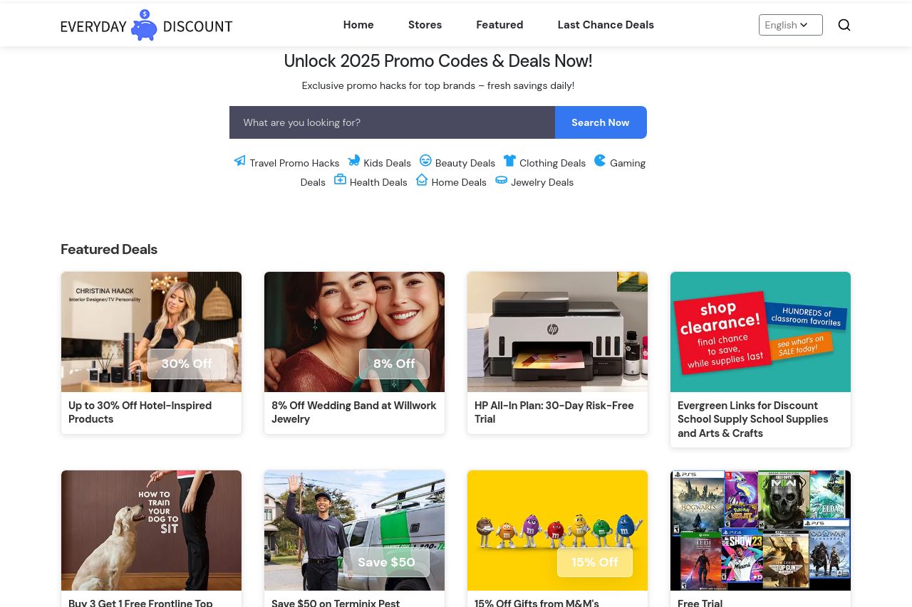
Unlock 2025 promo codes, deals & exclusive promo hacks at EverydayDiscount! Fresh savings daily on top brands. Grab now!

Summary:
The landing page for Everyday Discount is reasonably structured, presenting a mix of featured and latest deals that appear visually appealing at first glance. However, it struggles with clarity and engagement due to a lack of emphasis on a clear, standout value proposition and an overabundance of varied text styles and colors competing for attention. The search function and sorting options are a plus but could be more prominently featured to encourage users to take action. Additionally, the CTA buttons don’t stand out enough, which is a missed opportunity for increasing conversion rates. While the site appears professional, the navigation through endless deal listings might become tedious without a streamlined flow or hierarchy of information. Strengthening the site's credibility through more prominent testimonials or partnerships may also enhance trust. Overall, the user experience could be improved with better-defined sections and more strategic use of design elements.
- Enhance the visual hierarchy by using consistent and distinct fonts for headings and body text.
- Make CTAs more prominent by using contrasting colors or larger sizes.
- Simplify and clarify the value proposition on the hero section for instant understanding.
- Improve the organization of deals into clearer categories for easier navigation.
- Include more customer testimonials or trust badges for credibility enhancement.