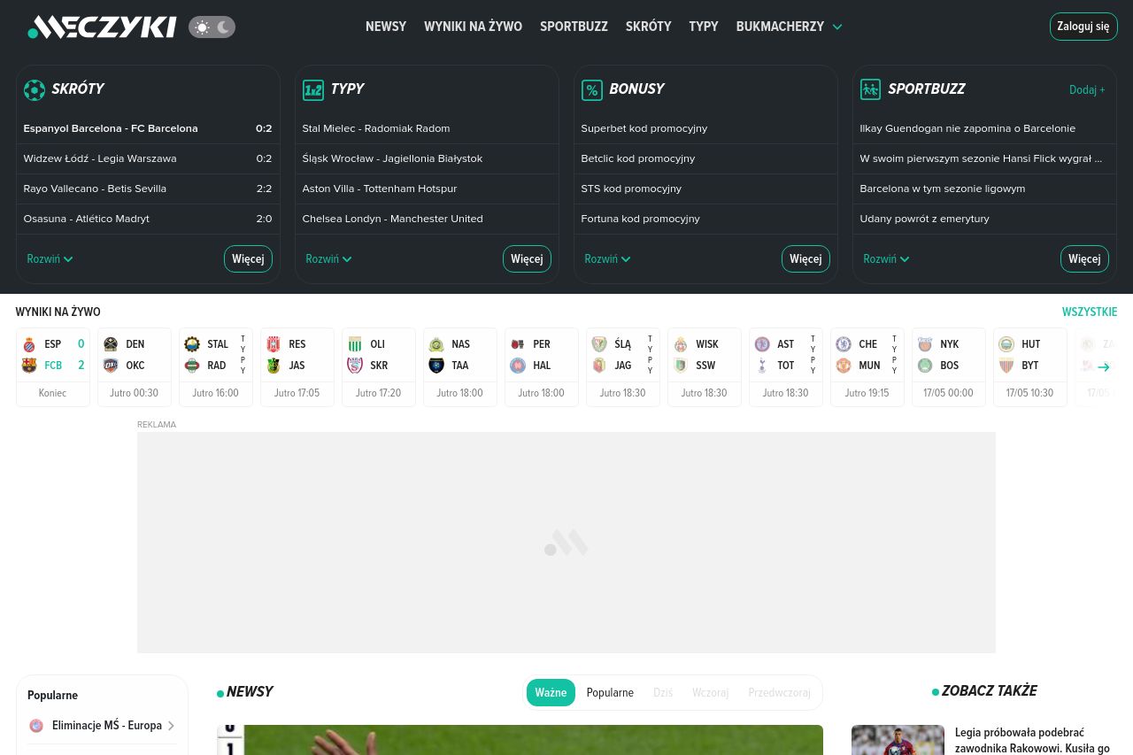
meczyki.pl
Landing Page Analysis
Portal sportowy oferujący najwięcej! Newsy, publicystyka, wyniki na żywo, statystyki, tabele, typy, memy - znajdziesz u nas wszystko!

Summary:
Meczyki.pl lacks a strong first impression with an overwhelming amount of information that isn't well-organized. The value proposition gets lost in the clutter, and essential details are buried under an avalanche of text and images. Readability suffers due to excessive text blocks and lack of simplicity, making quick comprehension difficult. While the design incorporates consistent elements like fonts and colors, it fails to make anything stand out. Structure is chaotic; the layout doesn't guide the eye naturally from one point to another, making the user experience cumbersome. Actions are muddled, with CTAs that blend into the noise of the page. Despite this, the site feels credible through recognizable branding and familiar design cues, yet loses points for the underwhelming Open Graph elements, lacking any draw-in power.
- Simplify and clarify the main value proposition prominently at the top of the page.
- Improve readability by reducing text blocks and enhancing typography for easier scanning.
- Re-structure the layout to guide users more intuitively through the content.