truesmarttech.com
Landing Page Analysis
Most bookkeeping software is accurate, but hard to use. We make the opposite trade-off, and hope you don’t get audited.

Summary:
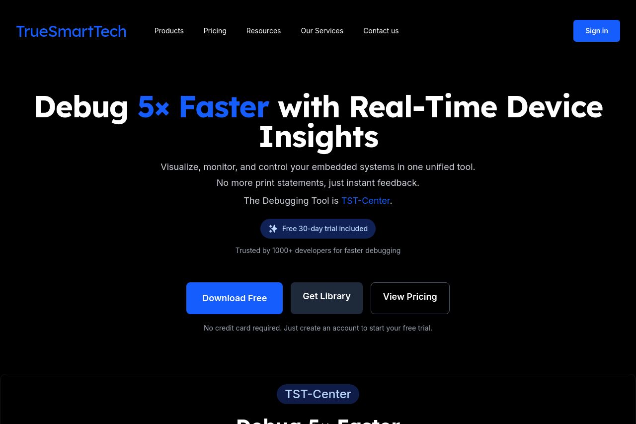
The landing page for TrueSmartTech does a commendable job of effectively communicating its primary value proposition right from the top with the prominent "Debug 5x Faster with Real-Time Device Insights" headline. The CTA buttons "Download Free," "Get Library," and "View Pricing" are visible and action-oriented. The consistent dark theme and blue accents fit well with the tech-focused audience. However, there are issues with readability, as some sections are dense and the text is small, especially in "Simple Implementation." The layout can be overwhelming since information overload occurs easily with so many options and features thrown at the user. Testimonials lend credibility, but without a recognizable name, it loses some impact. The site's structure is generally logical, leading users from problem statement to solution efficiently, but many CTAs that seem redundant may distract rather than assist. The biggest miss is the lack of Open Graph data which might hamper social sharing.
- Optimize text size and spacing in dense sections like "Simple Implementation" to improve readability.
- Consolidate redundant CTAs to maintain focus and avoid distractions like too many download options.
- Add Open Graph data to enhance sharing on social media platforms.