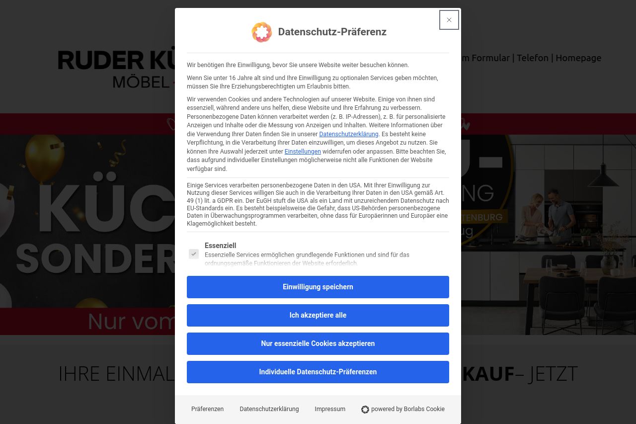
kuechen-sonderverkauf.com
Landing Page Analysis

Summary:
The landing page for "Küchen-Sonderverkauf Ruder Küchen" presents a mixed experience. The cookie consent banner is overwhelming, repetitive, and dominates the screen without allowing users to easily dismiss it. This seriously interrupts the user journey as it covers key sections of the website, including promotional banners and content. The prominent red CTA "JETZT DIREKT TERMIN SICHERN!" stands out, easily guiding users toward important actions, though the sheer size and repetition could come off as excessively pushy. The section titles such as "Kunden zufriedenheit ist unsere Stärke!" attempt to inspire trust but visually blend too much into the rest of the content, lacking differentiation and impact. While the product offerings might be enticing, the overall organization and presentation of details feel somewhat cluttered, which can confuse visitors. The lack of Open Graph data or description also misses an opportunity to capture interest via social sharing. Overall, the page needs more finesse in handling user experience and visual hierarchy to improve engagement.
- Reduce the size and prominence of the cookie consent banner to improve user experience.
- Increase differentiation in section titles through design alterations like font size or color contrast.
- Consider adding Open Graph data for better social media visibility and engagement.