vercel.app
Landing Page Analysis
Lovable Generated Project

Summary:
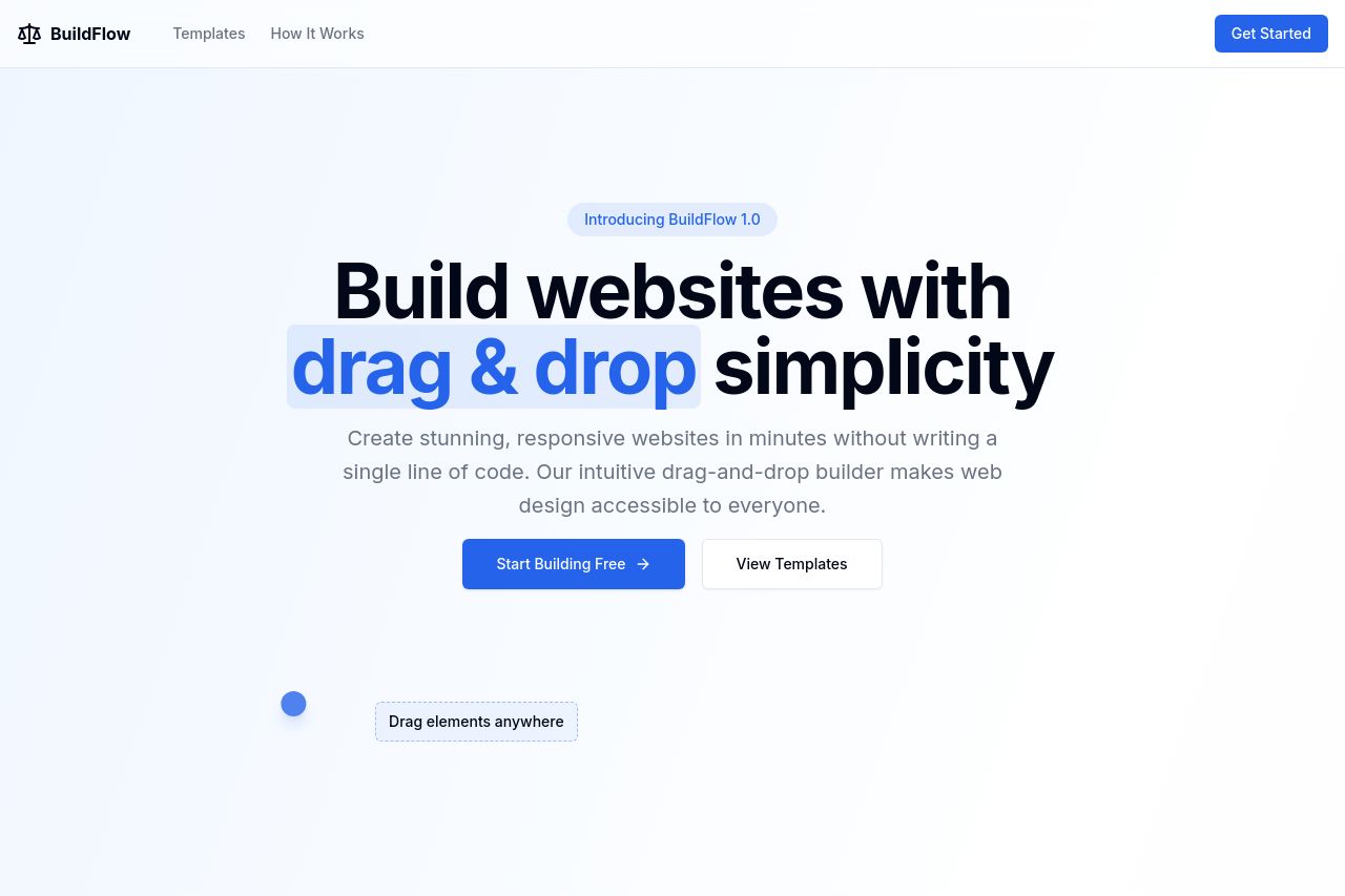
The landing page for BuildFlow is clean with a straightforward design, but suffers from several shortcomings. The hero section key message is buried under generic and uninspired headings, failing to immediately communicate a compelling value proposition. The layout is neat, yet it lacks distinction in visual hierarchy, making important elements like CTAs blend into the background. The color scheme is basic, lacking excitement, and fails to guide the user's attention effectively. While the content is easy to read and devoid of complex jargon, the typography and design consistency do not stand out, resulting in a rather mundane presentation. Despite having some sections logically organized, the overall structure does little to tell an engaging story about the product's capabilities. Social proof and transparency elements, essential for credibility, are notably absent, raising questions about trust. Overall, this page needs a serious uplift in both messaging clarity and engaging visuals to hit the mark.
- Clarify and enhance the main value proposition in the hero section to make it compelling and specific.
- Introduce imagery or icons that support the message clearly to make the content more visually appealing.
- Improve the CTA buttons by making them more prominent and action-oriented, such as 'Get Started with BuildFlow' instead of 'Start Building Free'.
- Add social proof elements like testimonials, reviews, or recognized client logos to establish credibility.
- Rework the Open Graph data for greater relevance and engagement with aligned visuals and descriptive text.