gr-site.com
Landing Page Analysis
Home
Summary:
The landing page of copybase.io has a straightforward and promising value proposition but is marred by inconsistent design elements.
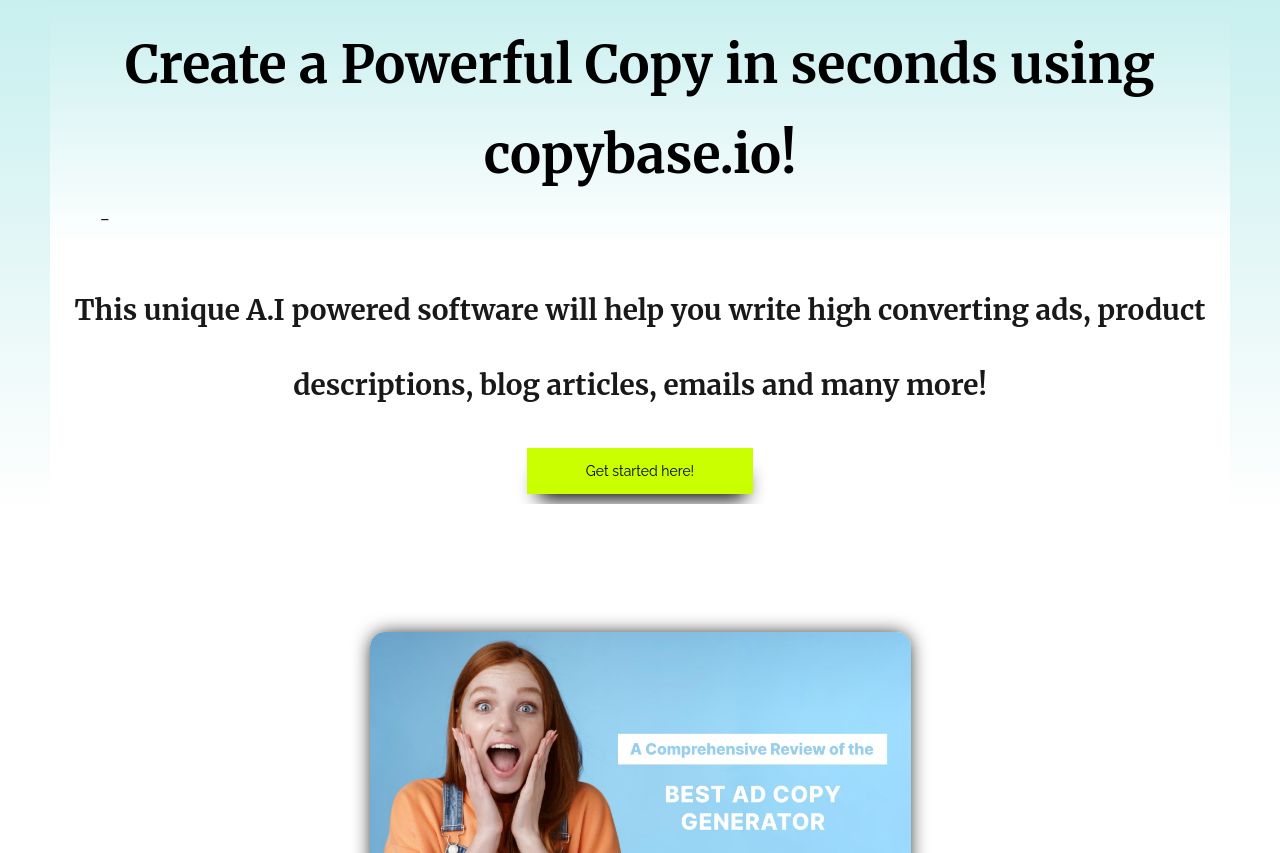
The headline, "Create a Powerful Copy in seconds," is bold but blends too much into the background, and there's room for clearer differentiation in typography to guide the eye more effectively. The color scheme is too jarring with the neon green button standing out awkwardly, which could be perceived more as discord rather than emphasis. The visuals themselves—a mix of human reaction shots and product mockups—create some intrigue but don’t always connect to the audience’s needs directly.
The messaging type could be seen as casual, which matches its broad target audience, but it feels a bit watered down without much specificity about the tool's unique features or competitive edge. The CTAs, such as "Get started here!" work functionally, yet lack urgency and distinctiveness. However, the testimonials section is a strong safety net, providing essential social proof.
While the page provides functional navigation through headings and CTA buttons, the information flow could benefit from more logical grouping of features and benefits, starting from introductory to more detailed and technical sections. The discount guarantee is visible, but the presentation is somewhat dry.
Overall professionalism and aesthetics may seem disrupted by inconsistent fonts, especially in the "Personal Note" which could sound more like a blog post rather than a professional sales pitch.
In summary, the page has potential but needs better visual harmony, clearer hierarchy, and more detailed audience targeting to truly convert.
- Standardize the Design: Ensure consistent use of fonts and colors across the page to create a cohesive look.
- Enhance Value Proposition: Define unique features and competitive advantages clearly within the introductory sections.
- Optimize CTAs: Use more compelling, action-driven phrases and prominence for CTAs to drive user action.