anlykiss.com
Landing Page Analysis
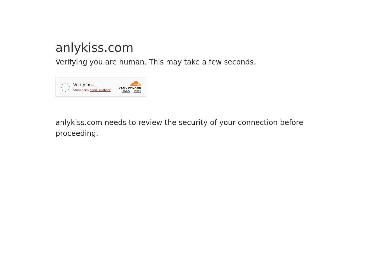
Verifying you are human. This may take a few seconds.

Summary:
Absolutely frustrating experience right from the start! The page prioritizes verification over content visibility, which can turn away users before they even get to see the landing page. There is no messaging, no engaging content, no visuals – absolutely nothing to give a hint about the brand's value or what they offer. It relies solely on text for the verification process, making visitors question the security or reliability of the website.
It's a terrible first impression and a missed opportunity to introduce the brand effectively. Instead of engaging users, they're waiting to determine if they can even access the content. No coherence, no design, just a plain, generic loading text with a frustrating message.
- Reduce or streamline security checks to improve user experience.
- Implement a holding message that reflects the brand’s value proposition and creates engagement.
- Add visual elements even during loading to enhance the design appeal.