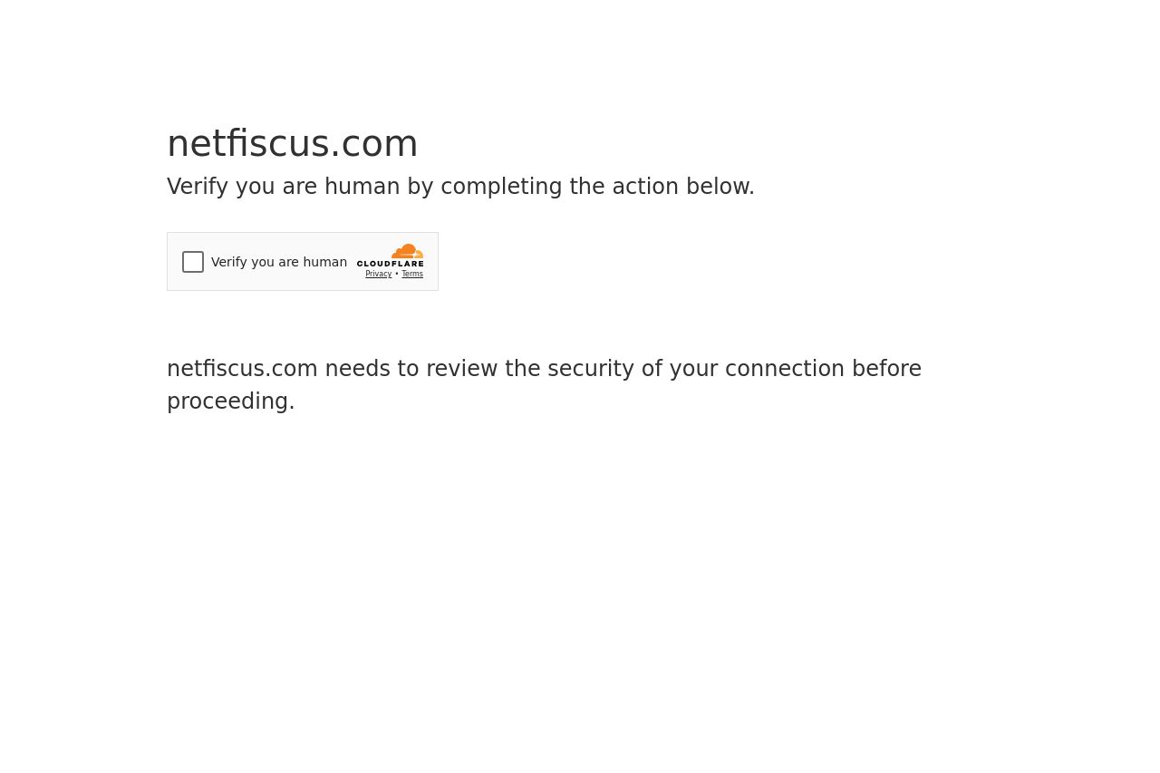
netfiscus.com
Landing Page Analysis
Verify you are human by completing the action below.

Summary:
This page's effectiveness is severely limited by its current setup. Instead of providing a welcoming homepage, users are met with an obstacle—a security check to verify their humanity. The absence of a proper landing page means there’s no opportunity to engage or persuade visitors, leaving them potentially frustrated or uninterested. There is no messaging, design, or content to analyze, resulting in an inability to provide an impactful first impression. All sections are non-existent, so we're missing vital elements like call-to-actions, social proof, or even a basic introduction to the site’s purpose. The verification process can create a negative initial experience, especially without proper context or reassurance about the site’s intentions.
- Create an engaging landing page that welcomes visitors instead of a CAPTCHA screen.
- Provide clear information explaining why verification is necessary.
- Include compelling content that immediately communicates the site's purpose and value proposition.