finedinemenu.com
Landing Page Analysis
85

Share on:
Summary:
88
Messaging
75
Readability
90
Structure
65
Actionability
75
Design
95
Credibility
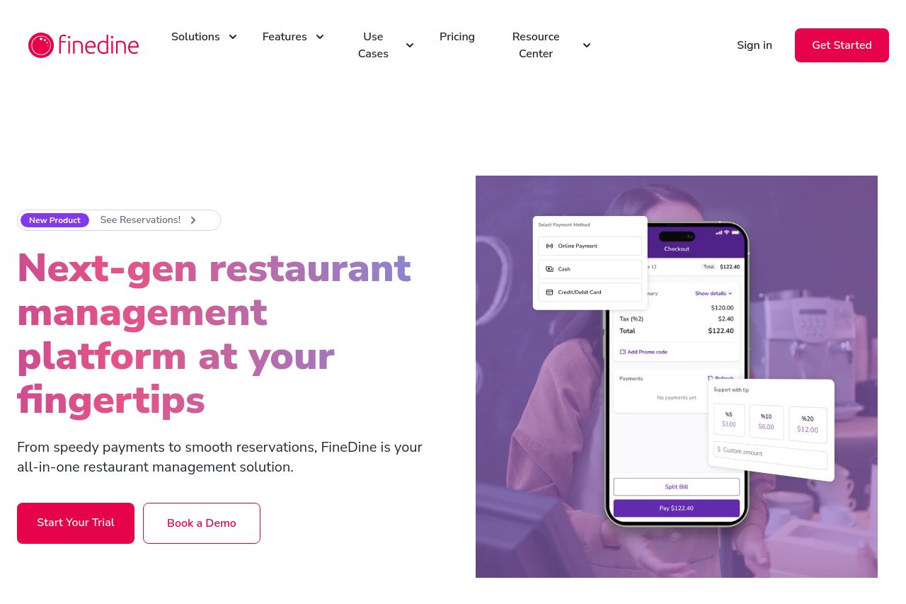
Overall, the website exhibits strong professional design elements and effective communication of value propositions. The main message is instantly clear with a focus on digital menu solutions, and the benefits are well articulated. There is a conscious use of whitespace and spacing to enhance readability. However, there are areas to improve: color consistency could use refinement as there's a slight clash that detracts from overall visual cohesion. CTAs are present but some lack verb-driven action. Social proof elements like client logos give credibility but could be bolder. Readability could be slightly improved by breaking down larger text blocks.
Main Recommendations:
- Enhance CTA buttons with more action-oriented text.
- Improve color consistency for better visual cohesion.
- Break down long paragraphs for increased readability.