truesmarttech.com
Landing Page Analysis
Most bookkeeping software is accurate, but hard to use. We make the opposite trade-off, and hope you don’t get audited.
Summary:
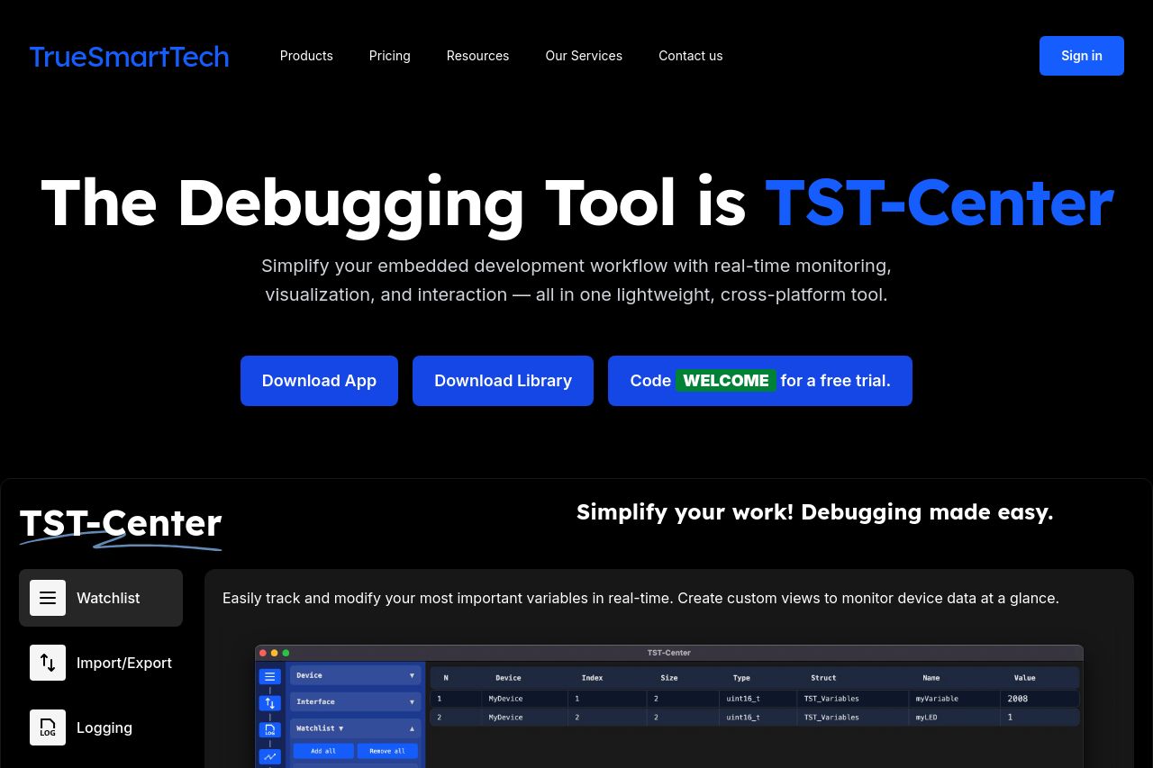
TrueSmartTech's landing page overall is quite cohesive but misses some crucial elements. The key message about embedded development is prominent, yet lacks precision and could be better targeted towards the audience. The tone is generally appropriate for tech-savvy users, but certain areas could use more energy and engagement.
Design-wise, the dark theme is clean but borders on being too monotone, leading to a lack of visual dynamism. Hierarchy is evident but could be improved with better-defined headings and increased contrast in certain areas. Navigation through sections seems intuitive enough, albeit a bit rigid.
Actionability suffers from overly generic CTAs that don't stand out enough. They lack strong motivation or urgency. Credibility stands strong with testimonials and cohesive messaging that aligns with the brand's trustworthy image, although explicit reassurances like security badges or detailed company information are minimal.
Overall, the page stays on course with tech sensibilities but should aim to refine clarity, engagement, and motivation further.
- Refine the value proposition to clearly communicate the unique benefits of the product to the target audience.
- Revise CTAs to be more specific and action-oriented to drive engagement.
- Increase contrast in the design to improve readability and visual interest.