framer.wiki
Landing Page Analysis
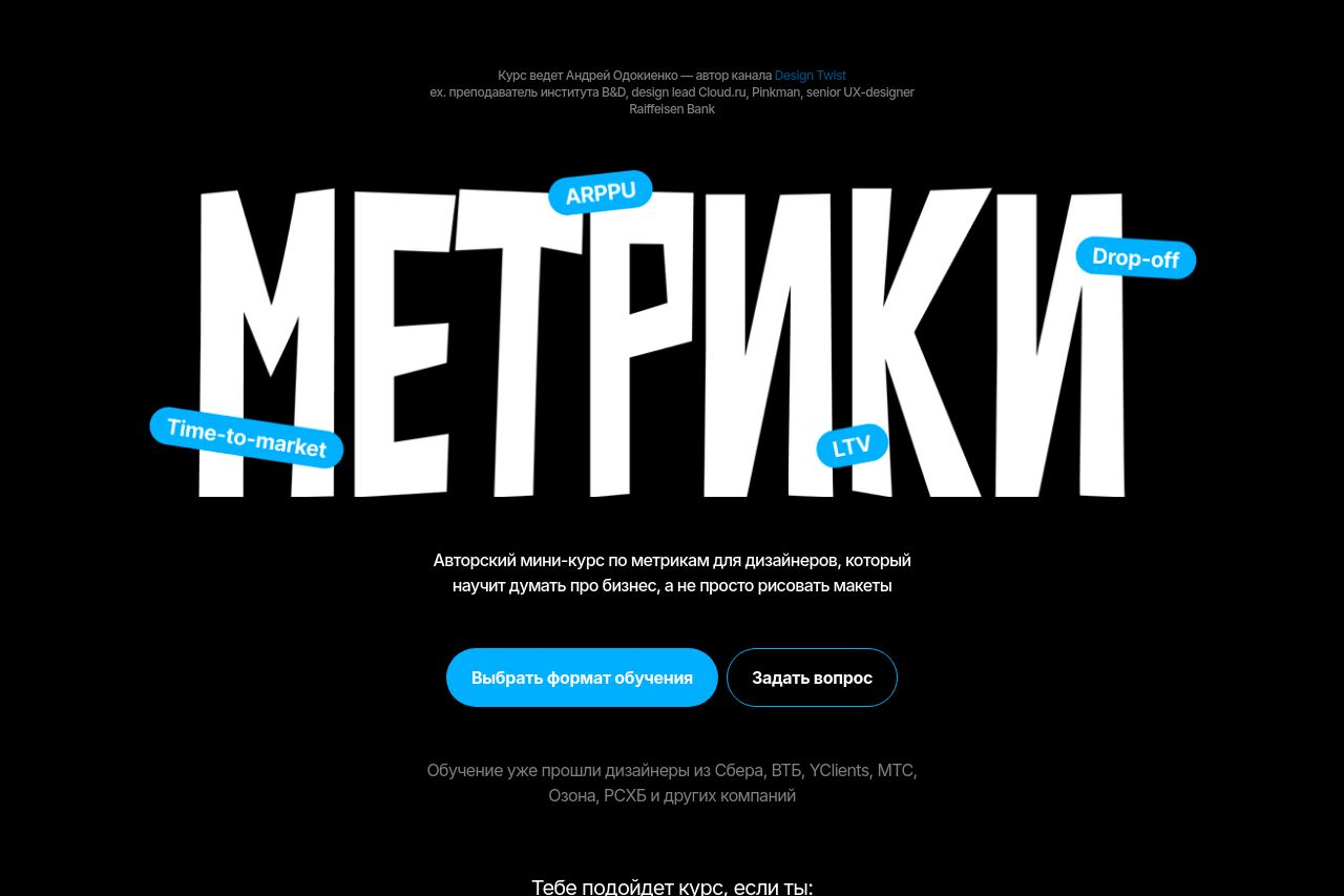
Авторский мини-курс по метрикам для дизайнеров

Summary:
The landing page has a strong, distinctive style with a unique approach to typography, using bold imagery to draw attention. However, the large, bold text is somewhat overwhelming, and the lack of clear separation between sections makes it harder to follow. The page does a decent job addressing specific audiences like juniors and seniors with tailored messages. Although the color scheme is simple and sleek, the contrast can be too stark, making it difficult to read certain text elements. The call-to-action buttons blend too much with other text blocks and lack immediate focus, slightly hurting conversion intrigue. While testimonials are included, they are buried towards the end without much emphasis, losing potential persuasive power. Overall, a more streamlined hierarchy and enhanced CTA visibility would improve usability and conversion.
- Increase the contrast between text and background for better readability.
- Reorganize testimonials for more emphasis and impact by placing them higher on the page.
- Make the call-to-action buttons more distinct from text blocks to grab attention better.