beleger.de
Landing Page Analysis
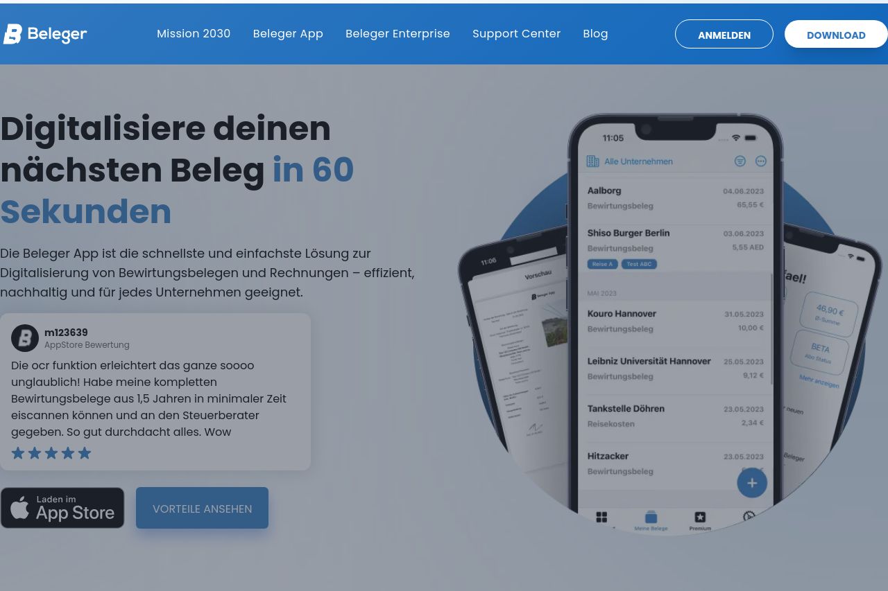
Digitalisiere Bewirtungsbelege und Rechnungen in 30 Sekunden. Beleger bietet sichere Cloud-Speicherung, Offline-Nutzung und OCR-Texterkennung.
Summary:
The landing page for Beleger is solid in terms of its overall concept but falls short in some areas that affect its effectiveness. The messaging kicks off strong with a clear and concise value proposition, but then it becomes cluttered with excessive and repetitive text, particularly in the feature section. The tone is casual yet professional, which fits the B2B audience, but there's an opportunity to enhance engagement further. Readability could improve with a bit more attention to font size and layout, as well as varying text blocks to avoid monotony. Design-wise, it's cohesive with consistent colors and elements, yet the page could benefit from refining the visual hierarchy to better guide the viewer's attention. In terms of structure, while the content is generally well-organized, some sections are overly verbose, burying the more critical information. The call-to-action buttons are decently placed but lack urgency and standout appeal. Credibility is bolstered with testimonials and recognizable elements, but the lack of some advanced trust elements slightly weakens it. Overall, the foundation is strong, but polishing the finer details could significantly boost performance.
- Simplify text and improve layout for readability.
- Enhance the visual hierarchy to guide attention better.
- Refine CTAs to increase urgency and visibility.