bestchoiceguide.net
Landing Page Analysis
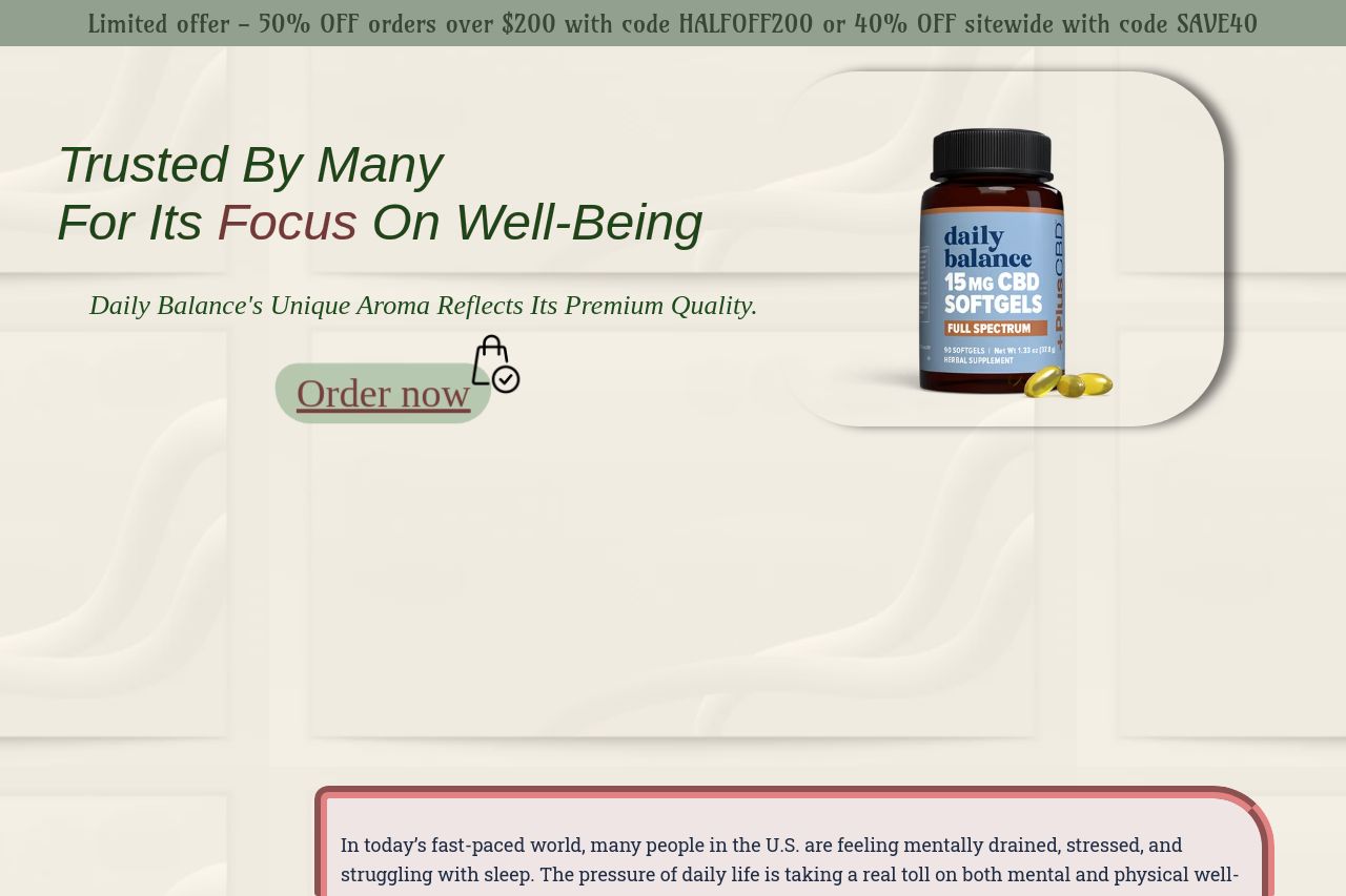
Trusted by many for its focus on well-being

Summary:
The landing page attempts to blend trust elements with promotional offers, but its execution is clunky.
The messaging feels scattered rather than focused, with jargon like "unique aroma" which doesn’t add much value to a supplement page. The credibility section benefits from the Trustpilot reviews, making it feel more reliable, but the consistency in design and typography needs serious attention.
Typography is inconsistent, making the page look amateur and lacking visual hierarchy. The text is the same color throughout, and the CTA buttons don’t pop enough to grab attention.
The layout gives a cluttered impression, with overlapping promotional text muddling the reading flow. Information hierarchy is a mess, throwing random elements without clear organization. It's hard to navigate, also distracting visually with too much happening at once.
The social proof is a highlight, although more recognizable logos could enhance impact. The attempt to create urgency isn’t very convincing; the special offer should feel more compelling.
In summary, clarity and a more organized layout are needed, with refined design elements to make the page truly functional and visually appealing.
- Clarify and focus the value proposition to be more direct and relevant to the audience.
- Improve visual hierarchy by using differentiated heading sizes and contrasting colors for important sections.
- Refine the calls to action to stand out and create a clearer path for the user journey.
- Reorganize information for better flow and accessibility, especially around key product details and offers.