icon.com
Landing Page Analysis
Summary:
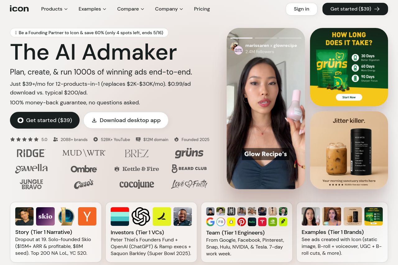
The landing page for 'The AI Admaker' hits the mark in several key areas but also leaves room for improvement.
The messaging is clear and direct, focusing on cost savings and a wide range of features. However, it falls short with alignment to a specific audience due to its overly broad language. On readability, the simplicity of the text is commendable, but the cluttered design and excessive number of elements hinder the visual clarity. The design scores fairly well, with a consistent use of colors and typography that delineates sections, but the overly busy layout dampens its overall efficacy. In terms of structure, the hierarchical flow of information is logical, guiding users through features and benefits effectively.
The credibility is boosted by recognizable brand logos and success metrics, yet the number of distractions limits actionability. Although the call-to-action buttons are placed strategically, their impact is lessened by the surrounding noise. Overall, the landing page conveys a wealth of information, but at the cost of user experience and engagement.
- Simplify and target messaging to specific audiences by using more focused language.
- Reduce visual clutter for improved readability and user experience.
- Increase whitespace and streamline CTAs to stand out.
- Balance the number of elements visible at once to avoid overwhelming users.