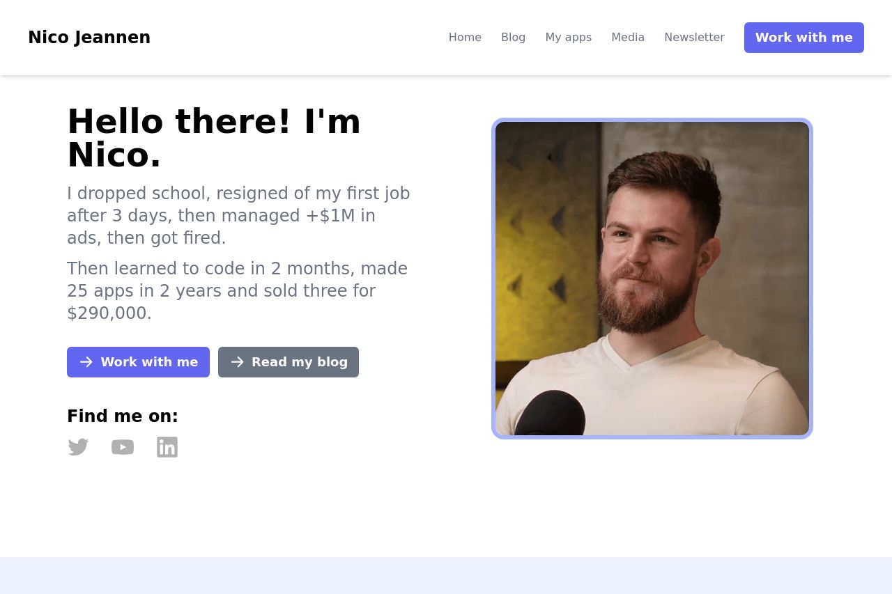
jeannen.com
Landing Page Analysis
Hey, I'm Nico! I make stuffs on the internet. I sucks with code but I compensate by beind decent at marketing

Summary:
The landing page starts strong with a personal touch, highlighting the owner's journey and achievements. The main headline "Hello there! I'm Nico." is personal and approachable, which can resonate well with the audience looking for authenticity. However, the design is very basic, which doesn't necessarily align with a high-converting professional appearance. The overall layout is uncluttered, but also lacks visual flair, making it feel somewhat generic. The project section does well to list the creator’s works, but these aren't highlighted enough to draw attention. The blog section provides useful content but suffers from a lack of engaging visuals or teasers.
- Enhance the visual appeal by introducing more vibrant colors and better image use.
- Improve social proof by including client testimonials or recognizable badges.
- Revise the Open Graph data for a more professional presentation.