ovalsustainability.com
Landing Page Analysis
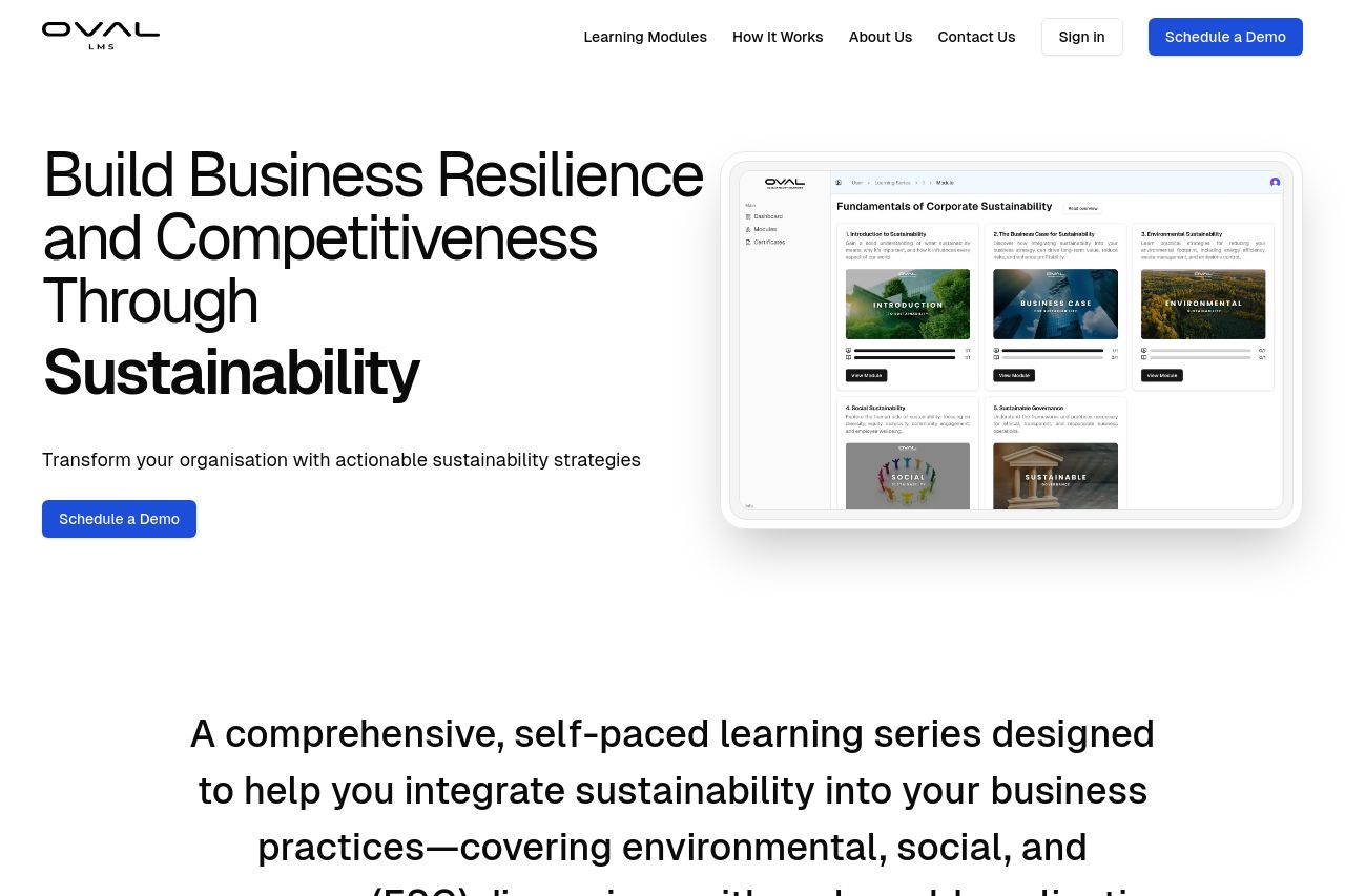
Oval LMS is an online learning management system focusing on the Triple Bottom Line (TBL), Environmental, Social, and Governance (ESG) framework, and the Sustainable Development Goals (SDGs).
69
Share on:
Summary:
70
Messaging
70
Readability
75
Structure
55
Actionability
65
Design
60
Credibility
Overall, the page does an okay job conveying its main messages with a few areas needing improvement.
Good Points:
- The headline is clear about sustainability and business resilience, providing a strong initial message. The modules are well laid out, and there's good use of icons to convey features and benefits.
Areas for Improvement:
- The color scheme is bland and lacks pop; the CTA buttons don't stand out. The text is mostly plain black on white, which can be tiring.
- Tone of voice is somewhat generic and could be more engaging or specific to sustainability professionals.
- CTA placement is somewhat overlooked, missing potential points where users are ready to act.
Specific Critiques:
- Reads a bit like a generic template without strong visual differentiation.
- Some headings and subheadings lack clear hierarchy, making navigation less intuitive.
- Few testimonials or logos shown to build trust/credibility.
Conclusion: A reasonable foundation, but needs more energy and engagement to truly capture and direct visitor attention effectively. Relying heavily on basic design principles without that extra touch leaves room for enhancing user experience.
Main Recommendations:
- Enhance the color scheme with more contrasting colors to improve CTA visibility.
- Introduce more engaging language and make use of testimonials or trust signals.
- Improve heading hierarchy for better readability and navigation.