yectra.com
Landing Page Analysis
Looking for hiring dedicated developers that can take up your business and provide it with a new identity in the digital world? Yectra will help with website design, e commerce and digital marketing s
Summary:
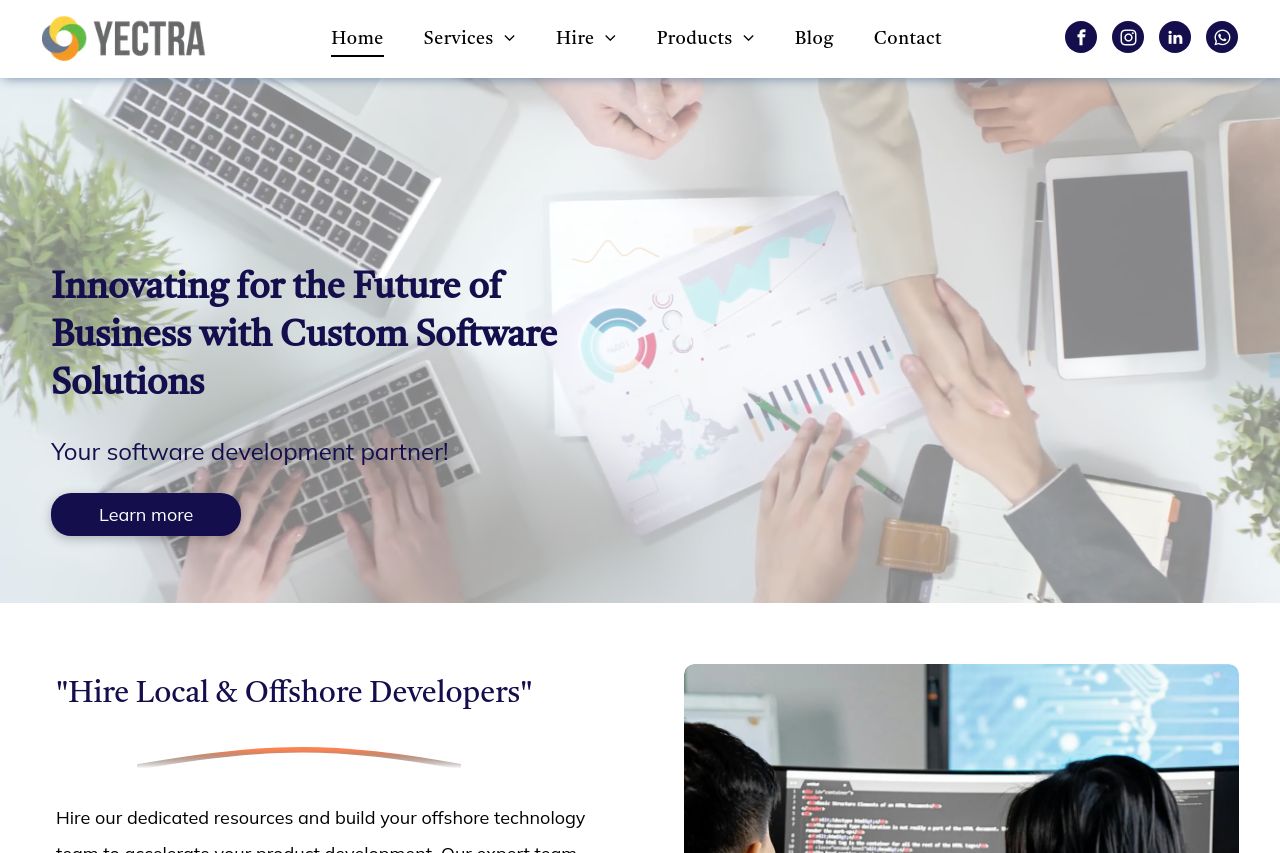
The landing page for Yectra does some things well but leaves room for improvement in several key areas. It manages to highlight a comprehensive range of services, from software development to digital marketing, using a fairly consistent visual style. The images and icons contribute positively to the user experience, lending an air of professionalism and legitimacy. However, the page is somewhat let down by the generic tone of its messaging. Phrases like "Innovating for the Future of Business" and "Your software development partner" are overly broad and don't quite capture a unique selling point. Moreover, the call-to-action buttons are not as prominent as they should be, failing to guide the user through a clear conversion path. While testimonials are present, they lack detail that could enhance credibility further. The structure could also benefit from tighter organization and more compelling copy to ensure potential clients are both informed and engaged.
- Enhance the value proposition with more specific, unique benefits.
- Improve the visibility and clarity of CTA buttons.
- Use more detailed testimonials with specific results or outcomes.