co.uk
Landing Page Analysis
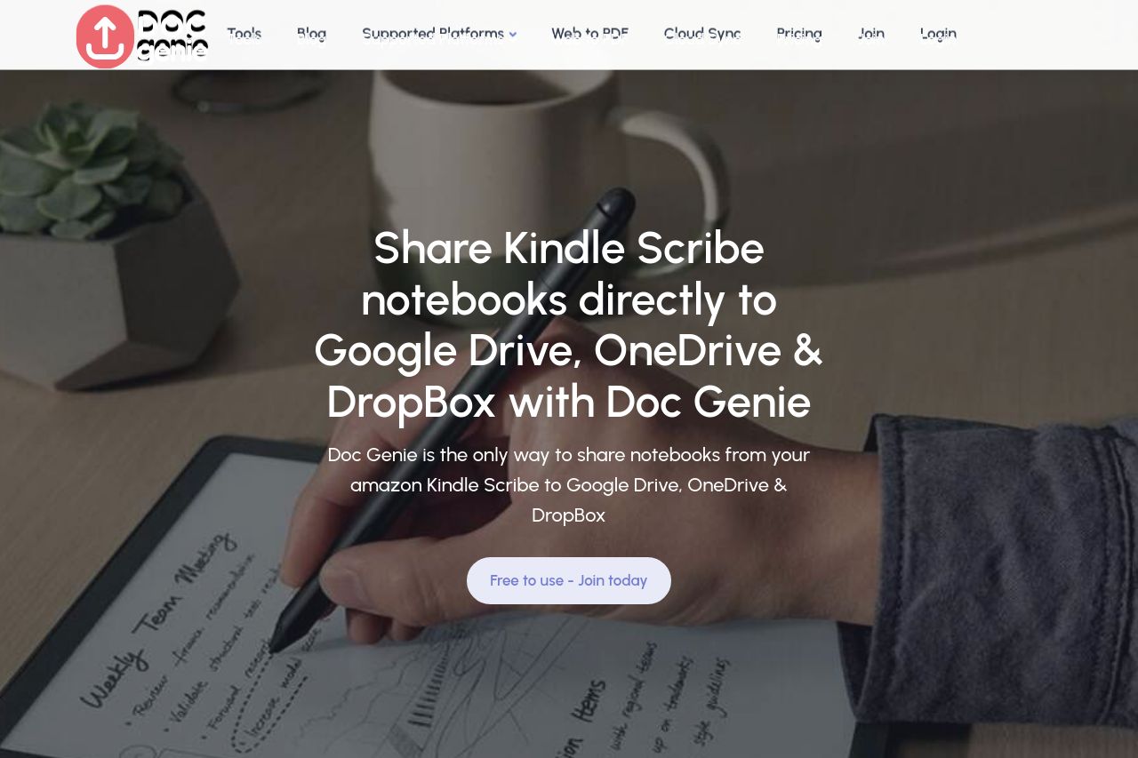
Easily export and sync your Kindle Scribe notebooks to Google Drive, Dropbox & OneDrive. Seamlessly backup, organize, and access your digital notes across all your cloud storage platforms.
Summary:
The landing page for Doc Genie has a clear focus on sharing Kindle Scribe notebooks to various cloud platforms. The value proposition is spelled out clearly in multiple sections, which is a positive. However, the repetitive nature of some text and sections feels redundant. The design uses a consistent color scheme that fits well with its brand but lacks strong visual hierarchy, making it somewhat hard to follow crucial information quickly.
The use of logos from trusted companies adds a layer of credibility, but there’s a lack of testimonials or real customer stories that could give a personal touch. CTAs like "Join for free" stand out, but persuasion elements like urgency or exclusivity are missing.
Typography is readable but could use more engaging formatting, like bullet points or icons, to break up the monotonous text blocks. While the sections are logically organized, they sometimes feel too long and dig into detail that could be presented more dynamically or interactively.
- Add testimonials or user reviews to increase trust and engagement.
- Utilize bullet points or icons to break up text-heavy sections for better readability.
- Introduce urgency in CTAs to drive quicker user action.