hubspot.com
Landing Page Analysis
Sign into your HubSpot account through HubSpot's login page. No login? Signup for a free account.

Summary:
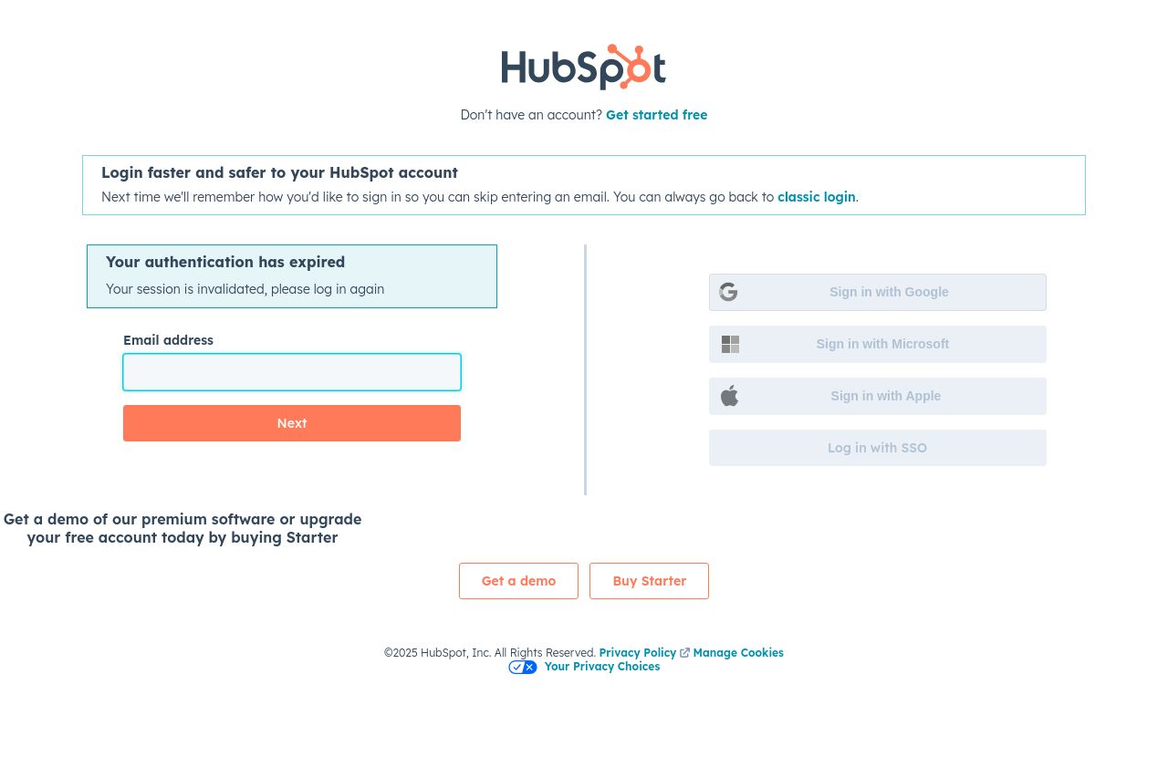
The page seems to aim for simplicity but unfortunately falls flat in terms of engagement and clarity. The use of whitespace is spot on, which keeps clutter to a minimum, but the overall feel is dull. The messaging could be sharper – it includes a repetitive structure without direct benefits or compelling hooks. It relies heavily on different login options without much emphasis on why you'd want to log in in the first place, aside from general functionality. The call to action for demos and upgrades isn’t particularly enticing and lacks urgency.
The design doesn't excel at creating any strong emotional or urgent drive. This is compounded by a lack of vibrant imagery or engaging graphics that could add life to the page. The only pop of color, the orange CTA, does provide a focal point, but it's underutilized amidst a sea of plainness.
- Increase the emotional appeal of the messaging to better engage users.
- Add compelling reasons or benefits for logging in or upgrading at the top of the page.
- Incorporate more vibrant visuals to enhance engagement and interest.