calai.app
Landing Page Analysis
Download Today
Summary:
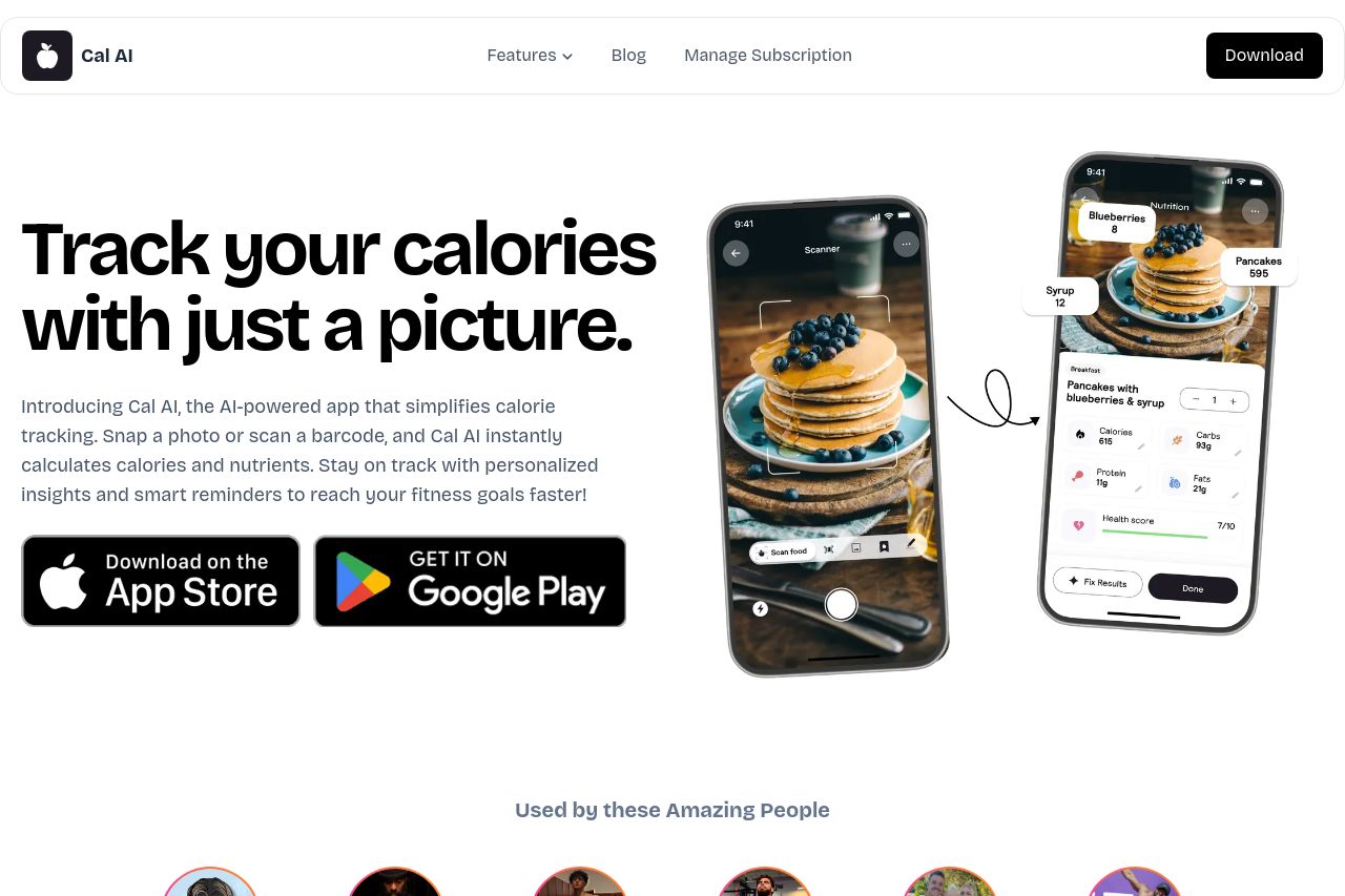
Cal AI's landing page is overall clean and organized, but doesn't quite hit the mark in several key areas. The value proposition is clear: track calories with a photo. The design is clean, but lacks punch. The hero section gets the message across well, but the rest of the page suffers from lack of engagement. Readability is quite strong, though it falters with too much repetitive text without visual diversification. The structure is relatively logical, but it feels like it meanders without clear transitions between sections. Actionability suffers due to weak call-to-action placements and poor reinforcement of why users should care about the product. Credibility is established with testimonials, but lacks heft without prominent social proof or testimonies from recognizable brands. The open graph is underwhelming with a nondescriptive title and missing descriptions, failing to create a memorable impression. Overall, it’s a mixed bag that needs tightening across several areas to shine.
- Enhance the CTA visibility and urgency by making it more prominent and time-sensitive.
- Integrate more dynamic and recognizable testimonials or user stories to boost credibility.
- Revise the Open Graph data with a strong, engaging description and eye-catching title.
- Break up long paragraphs with bullet points or visuals to improve readability.
- Improve color contrast in some sections to enhance visual engagement.