deploforce.com
Landing Page Analysis
AI-powered assistance for Salesforce developers and administrators
Summary:
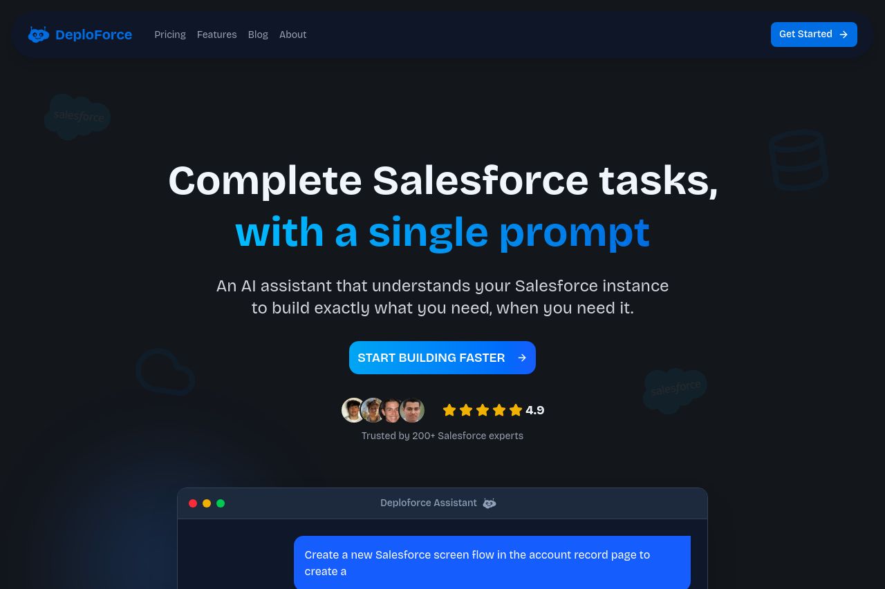
DeploForce's landing page effectively communicates its value proposition to Salesforce developers and admins, emphasizing AI capabilities to streamline Salesforce tasks. It uses crystal-clear headings and supportive visuals to convey the message. However, some sections could benefit from enhanced CTAs and improved typography, especially given the technicality of the subject. The use of trust badges and client logos adds credibility, though the design feels a bit consistent yet monotonous throughout, lacking any dynamic elements to catch the eye. While the structure is generally coherent, rearranging certain sections could lead to a smoother reading flow. Text readability could also be optimized by breaking down some dense sections and utilizing more visual hierarchy techniques to guide the user more effectively through the content.
- Enhance the contrast and typography for better readability.
- Rearrange content to improve the natural reading flow.
- Develop distinctive, action-oriented CTAs in each section.