feedbackpulse.io
Landing Page Analysis
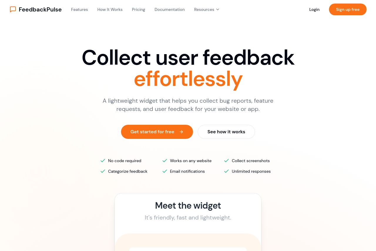
A lightweight widget that helps you collect bug reports, feature requests, and user feedback for your website or app.
Summary:
The FeedbackPulse landing page exhibits a clean and professional design, accompanied by a straightforward messaging strategy. The value proposition, "Collect user feedback effortlessly," is clear but somewhat generic. The page effectively lists features like "No code required" and "Works on any website," which are crucial for B2B SaaS founders and marketing professionals but lacks depth in illustrating specific benefits or advanced use cases for seasoned Product Managers.
The "Sign up free" CTA stands out with a bold orange color, but the placement seems repetitive and could benefit from appearing where decision-making is most incentivized. Social proof through testimonials adds credibility, though it would be strengthened by showcasing client logos or partnerships more prominently across sections.
The structure logically flows from features to how the service works, although the "How It Works" section could be enhanced with visual demonstrations to "show, don't tell." Pricing is well-presented, offering transparency, yet more detailed comparisons could aid serious B2B buyers.
Overall, while the page is professional and easy to read, it could refine its approach to better engage audiences with complex needs and bolster trust through established partnerships.
- Emphasize specific benefits tailored to expert audiences, such as Product Managers.
- Include more client logos or recognizable partnerships to boost credibility.
- Enhance visual demonstrations in the 'How It Works' section, such as videos or animations.