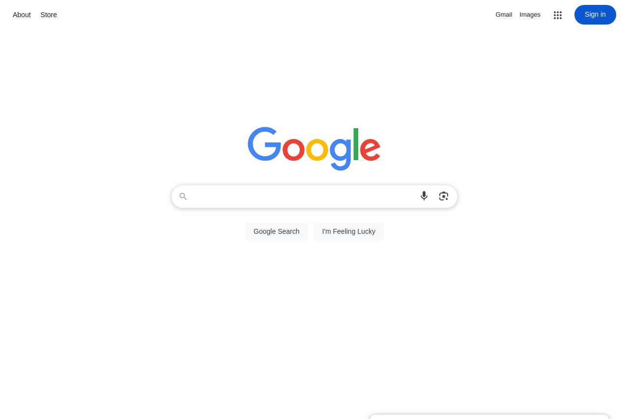
google.com
Landing Page Analysis

Summary:
The landing page is simplistic and incredibly user-focused, sticking to its core function—search—without any unnecessary fluff. This minimalism is its strength, ensuring users aren't distracted from the primary task. However, it's so spartan that it doesn't provide much beyond the search functionality.
The branding is a powerhouse, recognizable instantly, so the logo alone carries weight. The "Sign in" prompt is clear, but hardly stands out in terms of visual hierarchy. It could use more emphasis considering how central account features are to the Google ecosystem.
Overall, the page is intentionally sparse to maintain focus, but some might argue that it's too plain, lacking any persuasive elements or secondary calls to action that could engage users further beyond search.
- Consider enhancing the visual emphasis on the 'Sign in' button to capitalize on user engagement.
- Introduce subtle visual cues or features to retain users beyond the search—perhaps highlighting more Google services while maintaining the minimal look.
- Experiment with more prominent CTAs for logging in, leveraging user accounts, or related services.