com.au
Landing Page Analysis
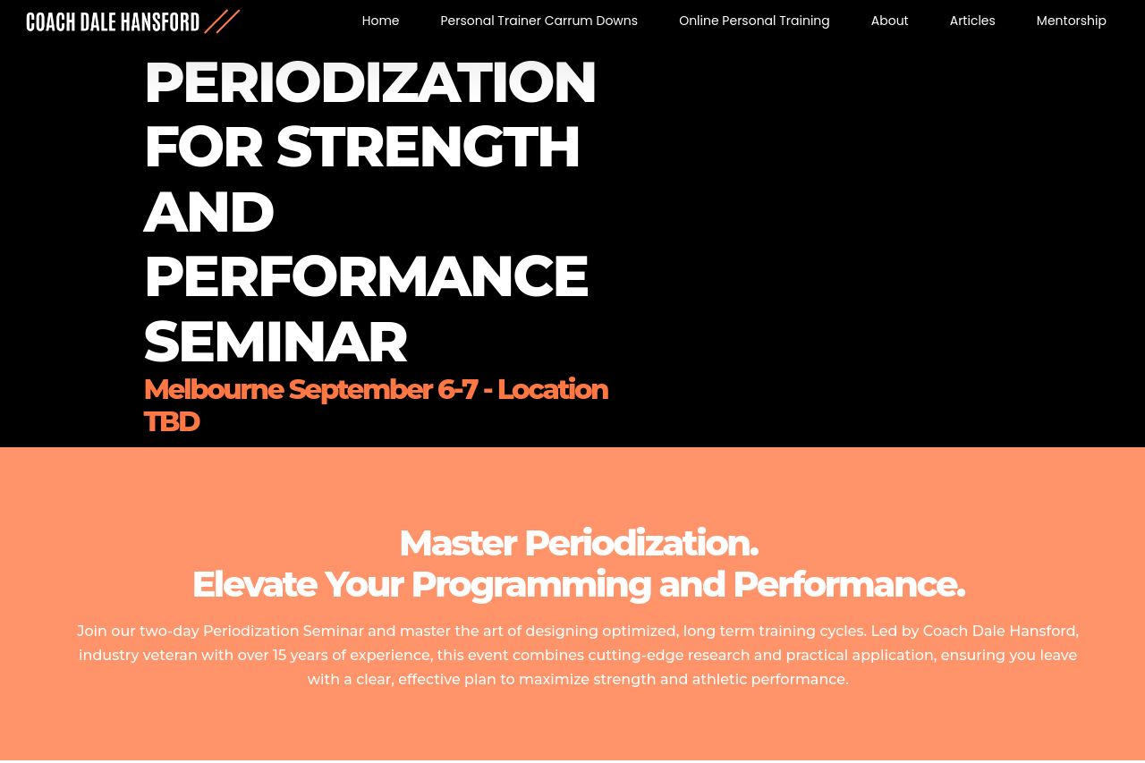
PERIODIZATION FOR STRENGTH AND PERFORMANCE SEMINAR Melbourne September 6-7 - Location TBD Master Periodization. Elevate Your Programming and Performance.Join our two-day Periodization Seminar and mast
Summary:
Overall, the page presents a clear value proposition with a focus on periodization for strength and performance, but suffers from issues in design consistency and CTA placement.
While the main value proposition is clear, stating the goal to master periodization for better programming and performance, the audience isn't explicitly defined beyond general gym-goers or trainers. The language used is quite dense and peppered with jargon which might deter less knowledgeable users, though it might resonate well with seasoned practitioners.
The design uses an eye-catching color scheme, but overuse of black and orange might detract from readability, especially in CTA areas. The site's typography is mostly consistent, yet the excessive use of bold text might overwhelm some readers. Headings and important information are distinct, which aids navigation; however, the sections could flow better, and the connection between sections appears somewhat disjointed.
Actionability is hindered by CTAs that blend into the page rather than standing out, lacking a strong verb or urgency that encourages action. The page does include decent credibility elements, with social proof indicators like a reference to the coach's experience, but it's lacking concrete testimonials or recognizable client logos that would bolster trust.
There is substantial room for improvement, particularly around user engagement, through CTA enhancement and clearer layout design.
- Enhance CTA visibility and actionability by using more contrasting colors and clearer verbs.
- Simplify the language to make complex ideas more accessible to a varied audience.
- Incorporate specific testimonials or client logos to strengthen credibility.