com.au
Landing Page Analysis
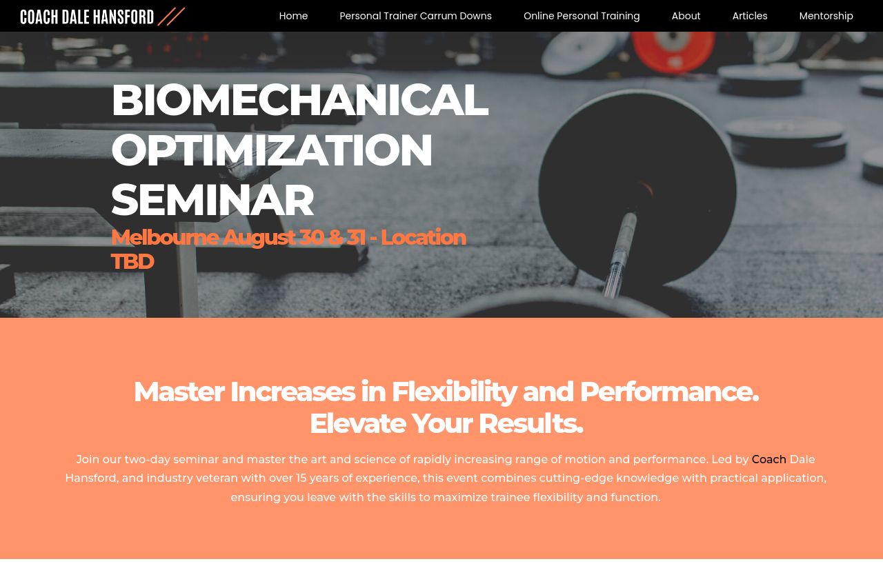
BIOMECHANICAL OPTIMIZATION SEMINAR Melbourne August 30 & 31 - Location TBD Master Increases in Flexibility and Performance. Elevate Your Results.Join our two-day seminar and master the art and science
61

Generated on:
April 23, 2025Score:
61/100Audience:
personal trainersShare on:
Summary:
70
Messaging
65
Readability
60
Structure
45
Actionability
50
Design
60
Credibility
The page has a clear value proposition, focusing on flexibility and performance, but it could be more engaging. The aesthetic is basic, with contrasting colors but lacking a modern touch. While the message aligns well with personal trainers, the design misses visual hierarchy to guide the reader. The CTAs need more prominence and specificity to improve actionability.
Main Recommendations:
- Enhance visual hierarchy by using different font sizes and weights.
- Improve CTA visibility with contrasting colors and specific verbs.
- Add more images or graphics to break up the text and illustrate key points.