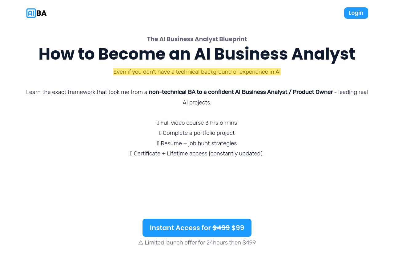
aiforbusinessanalysts.com
Landing Page Analysis
Becoming an AI Business Analyst even without a technical background and future proof your career

Summary:
Great use of testimonials and social proof! The landing page effectively uses testimonials and a crisp design to build trust. The urgency created with countdowns and pricing also adds pressure to convert. However, the visual consistency takes a hit with varying colors and font weights making it look cluttered. The messaging is a mixed bag, with some repetitive and overly generic content that could confuse users. Really dig deep into what makes your course unique and show it more clearly. Text simplicity is lacking. The content has unnecessary complexity; shorter and sharper copy would enhance readability. The call-to-action placement is decent, but the design needs a boost to stand out further. Saturating the page with the same CTA can dilute its importance. Overall, the design screams for consistency to improve UI/UX.
- Streamline the visual hierarchy with consistent font sizes and weights.
- Simplify text by reducing jargon. Focus on clear, direct language.
- Improve CTA design to stand out, using color or placement more effectively.