segurmaproteccion.com
Landing Page Analysis
Protege tu negocio con sistemas de alarma inteligentes para empresas. Monitoreo 24/7, instalación gratuita y presupuestos personalizados para todo tipo de comercios e industrias.
Summary:
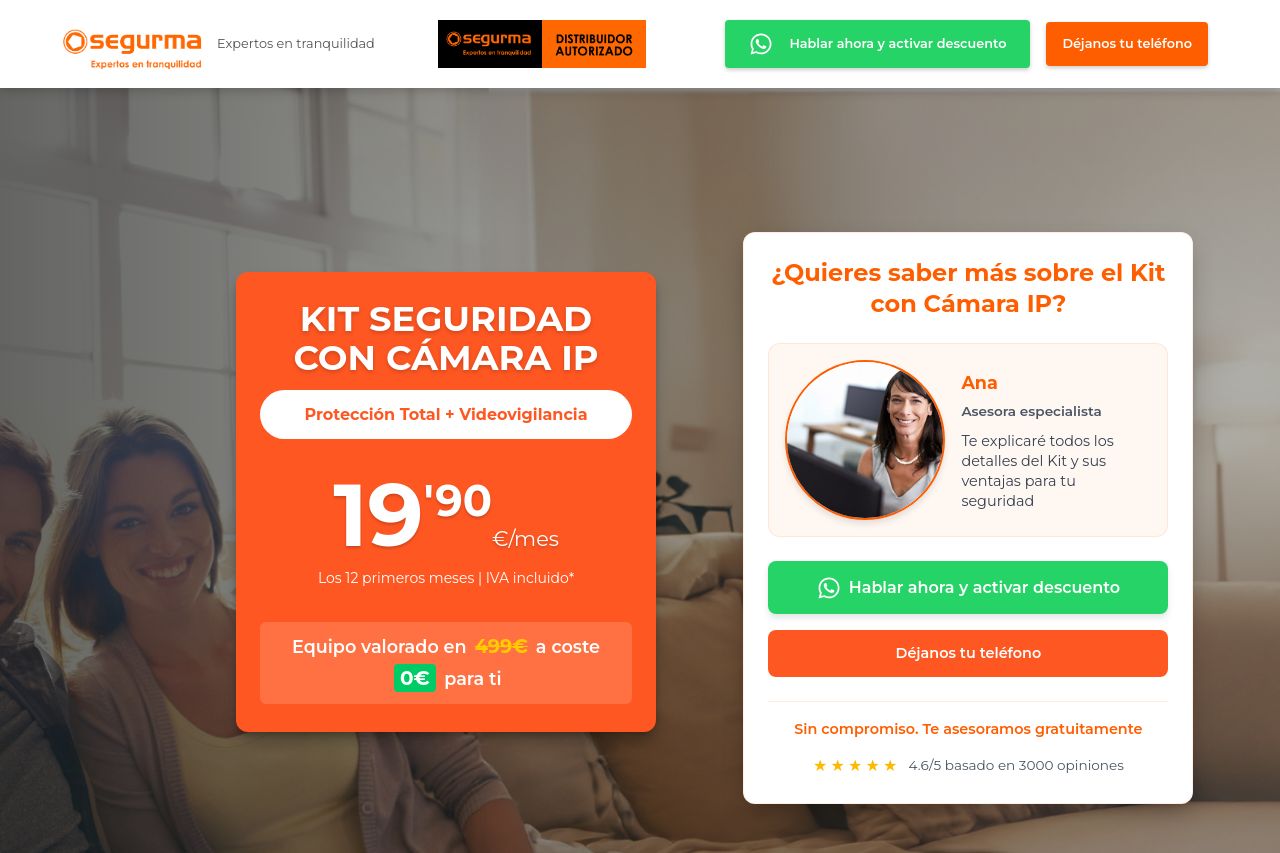
The landing page for Segurma displays a strong focus on both visual appeal and informative content, yet it struggles in some areas that impact user experience and engagement. The value proposition is mostly clear, though the focus on price could be emphasized more with urgency or exclusivity to create a better call-to-action.
The design implements strong color contrast, enhancing the call to actions but sometimes running the risk of appearing a bit too loud in certain sections. The consistency in the design is commendable, maintaining a uniform look across sections.
However, readability issues arise due to dense text blocks and lack of hierarchical text formatting, making it difficult to skim and grasp key information quickly. The navigation flow is logical, but a few minor tweaks could enhance the browsing experience significantly.
Calls to actions are present, but they lack the punch needed to convert effectively. Credibility elements like testimonials and security branding help build trust, yet they could be showcased more prominently to instill further confidence. Overall, the page serves its purpose but needs refinement in how it communicates urgency and simplicity.
- Enhance CTA texts with more action-oriented language and make them stand out more visually.
- Revise text sections to ensure concise, digestible information with improved formatting like bullet points or headers.
- Showcase credibility elements such as testimonials and trust badges more prominently for better trust-building.