marlink.agency
Landing Page Analysis
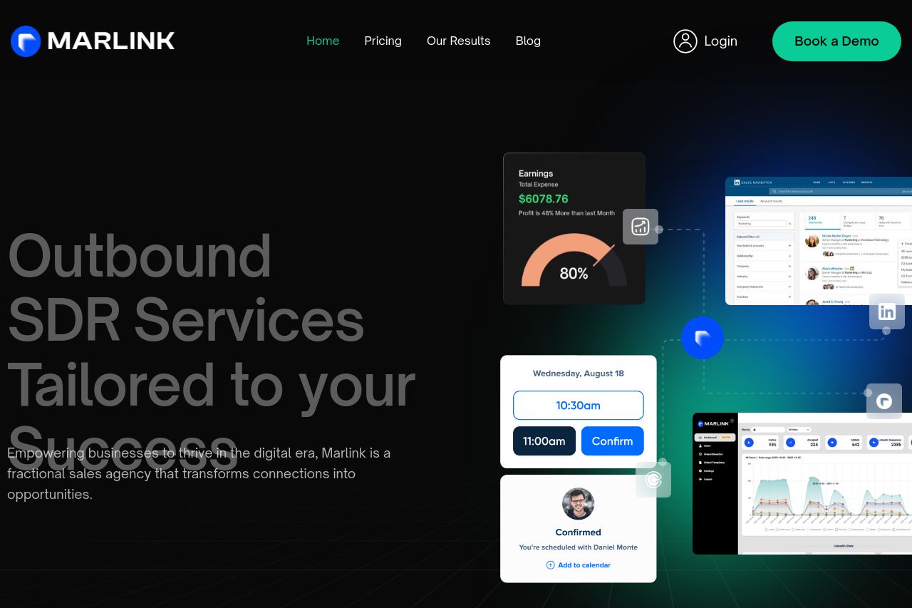
Empowering businesses to thrive in the digital era, Marlink is a boutique LinkedIn Marketing agency that transforms connections into opportunities.
Summary:
The Marlink landing page attempts to establish itself as a go-to solution for LinkedIn marketing, but falls short in a few key areas. The hero section does a good job of grabbing attention with bold text and a visually engaging image layout. However, the message isn't immediately clear, requiring more effort from the visitor to understand what Marlink does exactly. The navigation is standard, but the call to action to "Book a Demo" is effectively placed and stands out, thanks to its color.
In terms of design, the color scheme is consistent, though heavily reliant on dark tones that might not appeal to all. The typography is readable but could be more varied in terms of size and weight to enhance the visual hierarchy. The content is generally laid out well, however, it suffers from occasional sections that feel out of place or too generic, failing to incite enthusiasm or action.
Messaging is a mixed bag; it’s professional yet lacks the punch needed to align deeply with business users who are looking for B2B SaaS marketing solutions. The text uses industry jargon without clearly explaining the benefits or features in a compelling manner. Credibility is partly established by logos of well-known companies, yet lacks customer testimonials or case studies that would add substantial weight.
The structure and flow could be optimized as not all sections logically lead to the next step in a continuous manner. Some information is buried or repeated unnecessarily, which interrupts the natural reading flow of the page.
- Improve clarity of the value proposition in the hero section.
- Add detailed case studies or client testimonials for credibility.
- Enhance the flow and coherence of section transitions.