conos.hu
Landing Page Analysis
Simplify your project workflow with Conos. Easily share files, manage punch lists, and approve plans, ensuring efficient collaboration and project success.
Summary:
Overall, the Conos landing page effectively communicates its value proposition to construction professionals through clear messaging and a clean, straightforward design.
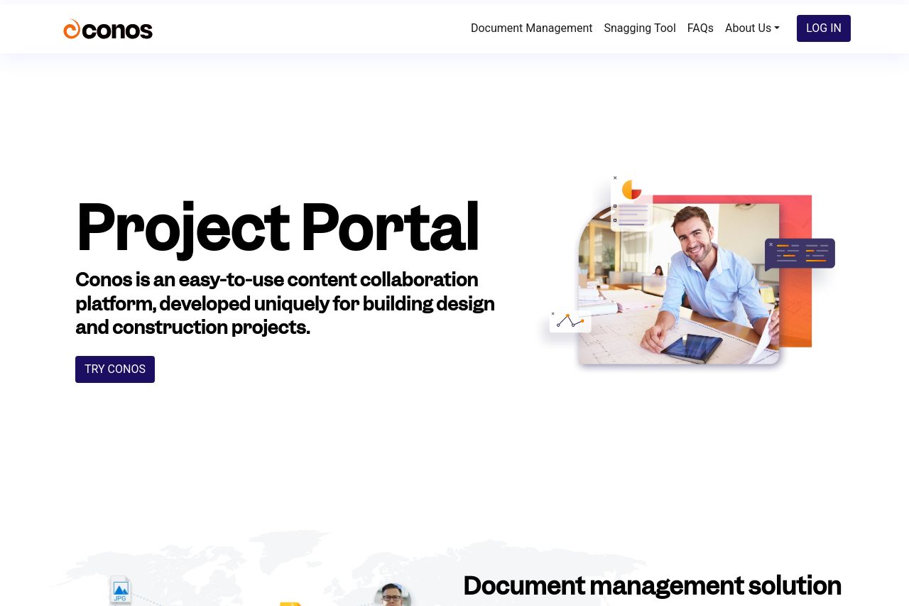
The page does a solid job of specifying that it’s a content collaboration platform designed for building design and construction projects. This immediately communicates the intent to the right audience, which is crucial.
However, the page lacks some critical elements.
The text, while clear, lacks variation in font sizes and styles, leading to a somewhat monotone reading experience. The call-to-action buttons, though present, sometimes fail to stand out against the rest of the design, especially in sections where the background color doesn't contrast enough with the button color.
The visual elements are consistent, but the color scheme could benefit from more vibrancy — a touch more boldness in headings or highlights could enhance engagement. Additionally, while the layout is mostly logical, some sections feel a bit text-heavy without enough visual breaks. More use of icons or simplified graphics could break the monotony and improve readability.
Social proof is subtle but present, though more recognizable logos or reviews could strengthen trust. Testimonials or case studies would be ideal to see how the product has impacted clients directly.
Overall, the page is functional and professional but lacks an emotional spark that could make it more engaging and persuasive for its target audience.
- Increase font size variation for better text hierarchy.
- Enhance call-to-action button contrast for visibility.
- Incorporate more visual elements like icons to break text.
- Add recognizable client logos or testimonials for trust.
- Use more dynamic colors to energize the page.